Best Fonts for Subtitles
In today’s digital age, subtitles and captions have become an essential part of video content creation. Whether you’re creating educational videos, short films, or social media content, choosing the right font for your subtitles can significantly impact viewer experience and engagement. The font you select can make or break the readability and overall appeal of your video.
History of Subtitles and Their Fonts
Subtitles have come a long way since their early days in silent films. The ancestor of modern subtitles can be traced back to intertitles, which were used to convey dialogue and narration in the early 20th century. As technology advanced, the subtitle and font markets evolved to meet the demands of the growing video industry. With the emergence of short-form video content, such as TikTok and Instagram Reels, the importance of effective subtitles and captions has only increased.
The origins of subtitles
Subtitles trace their roots back to intertitles in silent films. These were text cards inserted between scenes to convey dialogue and narration. The intertitle fonts were simple and easy to read, like Times New Roman or Arial.
How subtitles and fonts evolved
With talkies, subtitles shifted to translating foreign films. This drove the design of specialized subtitle fonts readable on different screens and resolutions. The digital age further revolutionized subtitles and fonts. With DVDs and streaming, subtitles became integral to the viewing experience. New fonts like Verdana and Tahoma emerged, prioritizing digital screen legibility.
The 9:16 video revolution
Recently, vertical 9:16 videos on platforms like TikTok have shaken up subtitles. Shortform videos need attention-grabbing yet readable subtitles on small mobile screens. Bold, sans-serif fonts like Montserrat and Rubik have become popular for this format. Online videos also rely on subtitles since many viewers watch on mute. Choosing the right subtitle font directly impacts engagement.
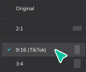
Change the Resolution on TikTok
In essence, subtitles and their fonts have evolved alongside the video industry itself from silent films to streaming and now vertical mobile videos. As formats change, subtitling and typography innovate to enhance the viewing experience.
Factors to Consider When Choosing Subtitle Fonts
When selecting a font for your subtitles, there are several key factors to keep in mind:
- Readability and legibility are paramount, as viewers need to be able to easily read and understand the text.
- Compatibility with various devices and screens is also crucial, as your video may be viewed on different platforms.
- Additionally, the font should be consistent with the video’s tone and style to create a cohesive viewing experience.
20 Best Fonts for Subtitles & Captions
Montserrat
Designed by Julieta Ulanovsky. The best overall subtitle font, Montserrat offers a modern and minimalistic design that works well in various video contexts. Its clean lines and excellent readability make it a top choice for content creators.

Best Fonts for Subtitles – Montserrat
Rubik
Ideal for videos with punchy messages, Rubik’s bold and attention-grabbing design helps your subtitles stand out. It’s particularly well suited for short, impactful videos on social media platforms.

Best Fonts for Subtitles – Rubik
Fira Sans Condensed
With its sleek and athletic appearance, Fira Sans Condensed is an excellent choice for fitness videos. Its condensed design allows for more text to fit on the screen without compromising readability.
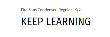
Best Fonts for Subtitles – Fira Sans Condensed
Garamond
Garamond’s elegant and classic design makes it a great choice for subtitles in historical or period videos. Its timeless appearance adds a touch of sophistication to your content.

Best Fonts for Subtitles – Garamond
Gabarito
Gabarito’s friendly and approachable design makes it a great option for motivational TikTok content. Its rounded edges and open letterforms convey a sense of warmth and positivity.

Best Fonts for Subtitles – Gabarito
Arial
As a simple and professional font, Arial is perfect for information-rich videos. Its widespread availability and familiarity make it a safe choice for ensuring readability across devices.
Verdana
Designed specifically for digital screens, Verdana offers excellent legibility in small sizes. Its generous spacing and distinct letterforms make it a reliable choice for subtitles and captions.
Poppins
With its clean and friendly appearance, Poppins is a top choice for educational videos. Its readability and versatility make it well-suited for a wide range of educational content.
DM Serif Display
For storytelling videos, DM Serif Display adds a touch of elegance and sophistication. Its serif design helps create a narrative feel and enhances the emotional impact of your content.
Opinion
Perfect for facecam videos, especially in the real estate industry, Opinion’s classic and trustworthy design conveys a sense of expertise and professionalism.
Trebuchet MS
Trebuchet MS offers a modern and friendly appearance that works well for a variety of video content. Its readability and compatibility across devices make it a reliable choice for subtitles and captions.
Lato
Lato’s clean and versatile design makes it a great choice for a wide range of video styles. Its subtle curves and excellent legibility make it a popular choice among content creators.
Roboto
Roboto’s modern and approachable design makes it well-suited for technology and innovation-related videos. Its clear and legible letterforms ensure that your subtitles are easily readable.
Helvetica Neue
As a classic and versatile font, Helvetica Neue is a reliable choice for subtitles in corporate or professional videos. Its clean and neutral appearance ensures that your message is conveyed effectively.
Futura
Futura’s geometric and avant-garde design makes it an excellent choice for fashion or art-related videos. Its bold and distinctive letterforms help your subtitles stand out and make a statement.
Playfair Display
For luxury or lifestyle videos, Playfair Display’s elegant and sophisticated design adds a touch of refinement to your subtitles. Its serif style conveys a sense of quality and exclusivity.
Raleway
Raleway’s modern and sleek appearance makes it well-suited for travel or adventure videos. Its clear and legible letterforms ensure that your subtitles are easily readable even in fast-paced scenes.
Open Sans
Open Sans’ friendly and approachable design makes it a great choice for personal vlogs or lifestyle videos. Its excellent readability and wide range of weights make it a versatile option for content creators.
Bebas Neue
For bold and impactful subtitles, Bebas Neue’s strong and condensed design is an excellent choice. Its all-caps style and tight letterspacing make it perfect for attention-grabbing headlines or callouts.
Merriweather
Merriweather’s warm and inviting design makes it well-suited for cooking or food-related videos. Its serif style and excellent readability make it a great choice for conveying recipes or cooking instructions.
When selecting a font for your subtitles and captions, it’s essential to consider the style and tone of your video, as well as the intended audience and viewing platform. By choosing one of these 20 best fonts for subtitles and captions, you’ll be able to enhance the readability and visual appeal of your video content, ensuring that your message is effectively conveyed to your viewers.
Tip. How to Add Captions to Videos with AI
Captions boost the accessibility and popularity of your videos by providing a text version of the audio, making dialogue, narration, and key sounds clearer to viewers. Better fonts of captions are the first element that you need to consider before you add captions to your video.
CapUp is such a powerful auto-captioning tool that simplifies adding captions to your video. And provide subtitle templates from well-known influencers like MrBeast, Ali Abdaal, Alex Hormozi, and Iman Gadzhi. Using these templates improves your content’s accessibility and appeal, potentially increasing your Shorts’ chances of going viral by reaching a wider audience.
Key features of CapUp:
- AI-Powered Captions: Generate multilingual captions with precision using AI.
- Emotional Emojis: Enhance content with emojis and highlight keywords.
- Smart Zoom: Focus on key moments to increase viewer engagement.
- Immersive Sound: Add sound effects for a richer, more emotional experience.
- Custom Captions: Tailor captions with various text and style options.
Steps to add captions in CapUp:
Step 1. Logging into your CapUp account. Simply upload your video with a single click.
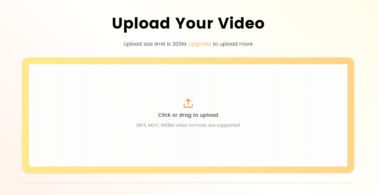
Log in and Upload the Video
Step 2. From the available options, choose the language for your video. Once selected, let CapUp process your video.
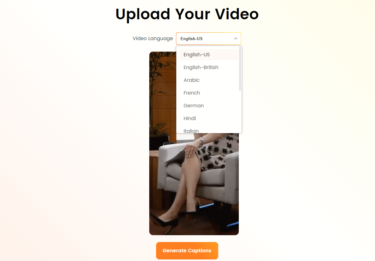
Select the Language that Matches Your Video
Step 3. Navigate to the “Template” section and select a design template from popular influencers to enhance your video’s visual appeal.
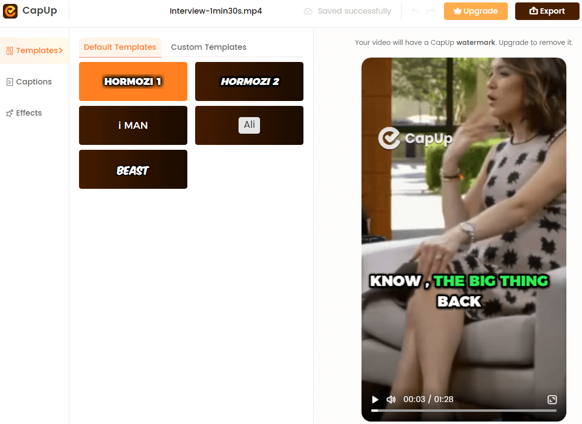
Select the Preset Caption Template
Step 4. Customize the template to fit your content and style. Refine captions for accuracy and greater impact, with options to change fonts, add emojis, and include sound effects and animations.

Add Subtitles to Videos
Step 5. Select a frame from your uploaded video or upload a new image to serve as the cover for your video. Once you’re satisfied with your edits, click “Export” to finalize and save your YouTube Shorts ready for sharing.

Export the Video
FAQs about Best Fonts for Subtitles and Captions
Can I use different fonts for subtitles and captions in the same video?
While it’s possible to use different fonts, it’s generally recommended to stick with one font throughout your video for consistency and ease of reading.
What font size should I use for subtitles and captions?
The ideal font size for subtitles and captions depends on the video’s resolution and the intended viewing device. A good rule of thumb is to use a font size between 12 and 18 points for optimal readability.
Are there any fonts I should avoid using for subtitles and captions?
Avoid using overly decorative or stylized fonts, as they can be difficult to read quickly. Stick with clean, simple, and legible fonts for the best viewer experience.
Conclusion
Choosing the right font for your subtitles and captions is a crucial aspect of creating engaging and accessible video content. By considering factors such as readability, legibility, compatibility, and consistency with your video’s style, you can enhance the overall viewer experience. Whether you opt for a modern and minimalistic font like Montserrat or a classic and trustworthy option like Opinion, the key is to prioritize your audience’s needs and preferences. By selecting one of the 10 best fonts for subtitles and captions highlighted in this article, you’ll be well on your way to creating captivating and effective video content.


