Miro vs Mural: Comparison of Two Best Whiteboard Platforms

Miro vs Mural
When we think of team collaboration, the first thing that comes to mind is an online whiteboard tool. Because whenever your teams need to brainstorm ideas, plan something, draw early prototypes, and explain information to coworkers, the whiteboard is always there to get you cover.
But the drawback is they are only helpful when your coworkers are in the same room. With time the work has become more remote, and the whiteboards are replaced with digital equivalents that intend to provide a better experience at less cost.
However, considering the numerous choices available in the market, you may be confused about which digital whiteboard is best for you. Here, we’ll look at two of the most popular digital whiteboard solutions in the market and determine which is better: Miro or Mural. Let’s get down to the details.
Table of Contents: hide
What is Miro?
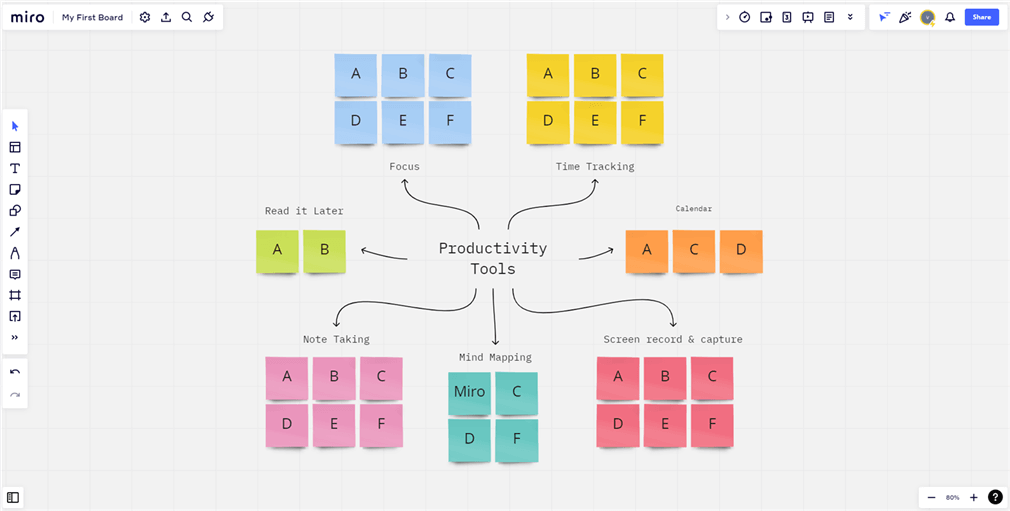
The user interface of Miro
Miro is a cloud-based online collaborative whiteboard platform for small to midsize organizations. It allows distributed teams to work together remotely and efficiently, providing features for brainstorming, running meetings, or hosting workshops to planning and managing agile workflows.
Miro is used by thousands of product managers and owners, UX/UI designers, agile coaches, and design thinkers around the globe to create the Next Big Things.
Miro Key Features
Whiteboard
It is extremely simple to use. There is no learning curve because it is as simple as a whiteboard. It is simple to set up and integrate an online whiteboard into existing workflows, as well as onboard new team members.
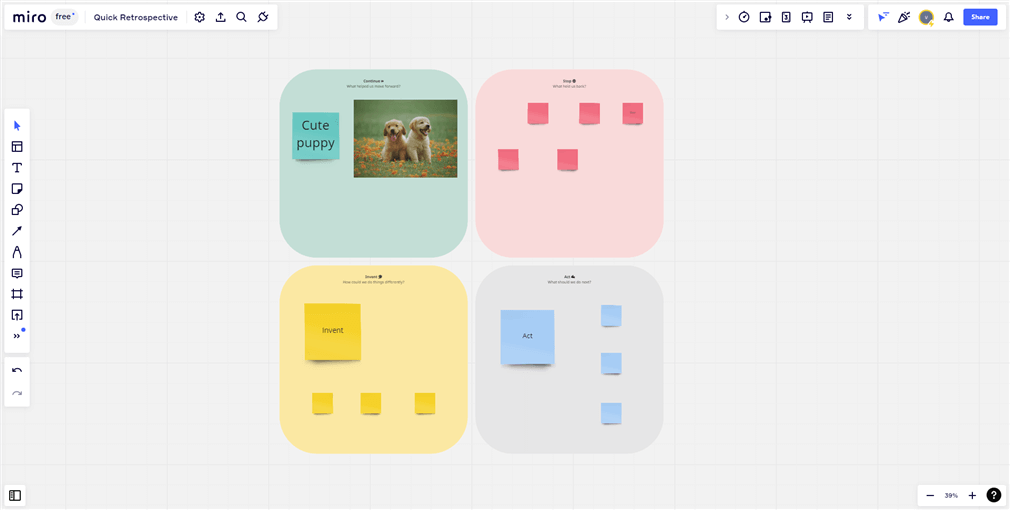
Miro whiteboard
Team Collaboration
Remote teams can collaborate in real time. Miro allows users to communicate in real time with powerful visual tools, discuss projects and ideas in board chats, leave tagged comments, and make voice and video calls.
You can also check out this guide on How to Record Team Meetings>
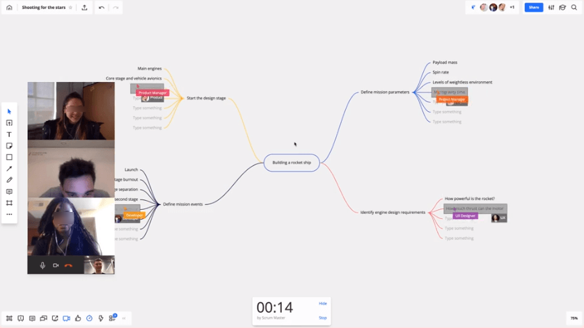
Video Call on Miro
Designing
A straightforward method for organizing creative workflow. Miro is a must-have tool for anyone working with design thinking and innovative concepts. Collect all individual and team ideas, create wireframes with post-it notes, and discuss and share with team members and clients.
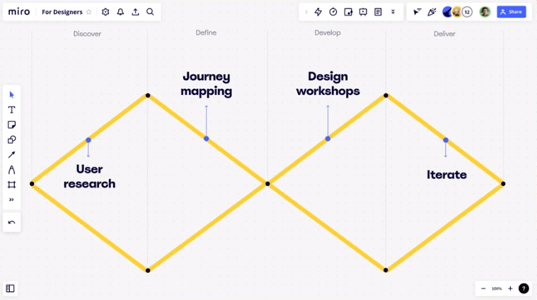
Workshop Mapping on Miro
Integrations
Miro integrates with over 100 apps like Google Calendar, Notion, Slack, Airtable, etc. The integrations help you align your teams and improve the efficiency of your work, all in one modular and secure space.
Miro Integration Apps
Templates
Miro offers a ton of ready-made templates to save you time and help your team collaborate efficiently. You can have a mind map template, blueprint framework template, flow chart template, event planning template, and many more. You can also convert your mindmap or workflow into a template and publish it for future use.

Miro Template Library Overview
What is Mural?
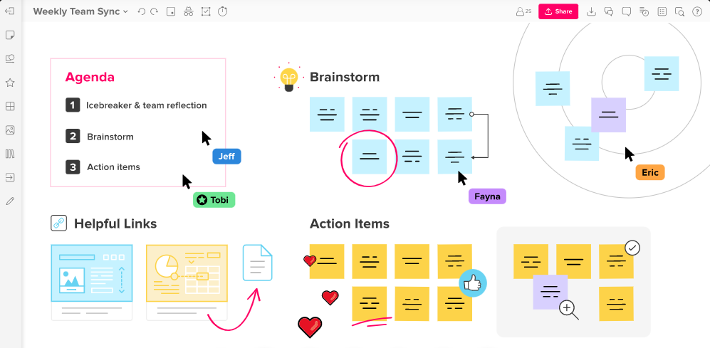
The user Interface of Mural
Mural is another collaboration management software that assists businesses in the planning, design, brainstorming, and analysis of ideas, as well as the creation of personalized workflows, to optimize decision-making functions across teams.
It has a ton of valuable functions, such as editable templates, jotting down thoughts in the form of mind maps, finding new clients, recapping meetings, suggesting new timelines, and more.
The platform also enables organizations to securely share data with team members by storing documents in a centralized AES-256 encrypted repository.
Mural Key Features
You’ll find that they have many similarities when comparing Miro and Mural. For instance, using a computer screen as a shared whiteboard is central to their plans. But they both have features that differentiate them, along with pros and cons. Let’s dig into the features of Mural:
Whiteboard
Mural provides digital whiteboards that can be accessed from any device, including mobile phones, tablets, and PCs, and used for visual collaboration on topics such as brainstorming, problem-solving, agile process management, design thinking, etc.

Mural Whiteboard Interface
Team collaboration
It allows groups to send invitations to one another so that they can work together on projects, share ideas, import photos, and distribute digital murals via links for others to view and comment on.
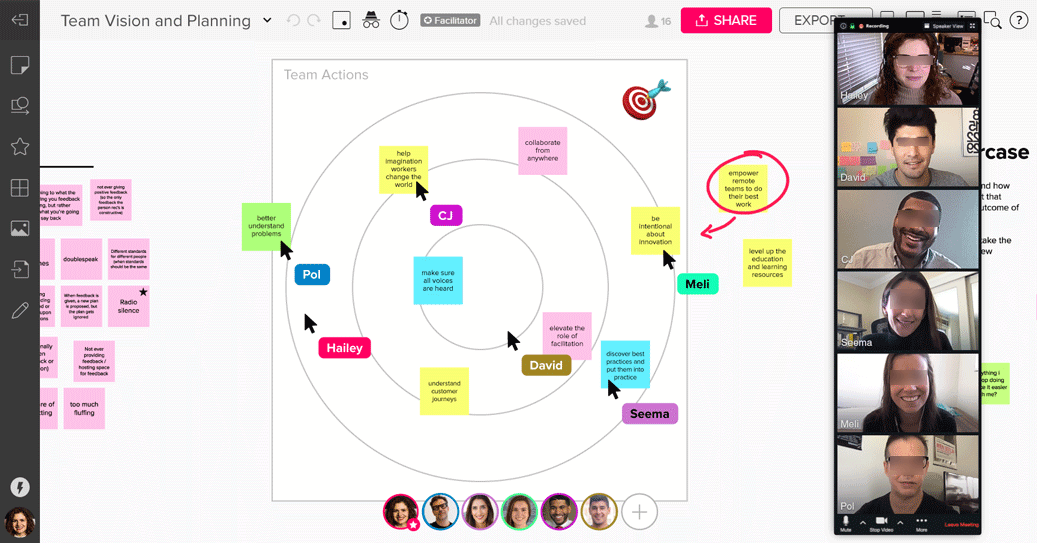
Video Meeting on Mural
Integrations
Mural’s integration with other valuable programs facilitates teamwork. Since Mural does not support video conferencing on its own, you can add that feature by linking the app to another service like Zoom. Airtable, Microsoft Teams, Adobe, Microsoft Word, and Dropbox are a few other popular platforms with seamless integrations.
Mural Integration Apps
Templates
Mural includes a ton of teambuilder templates for project planning, retrospectives, project kickoffs, visualizations, and agile workflows. Teams can also make their own unique templates. Mural’s templates are the most user-friendly of the two platforms because of how quickly you can get started with them.
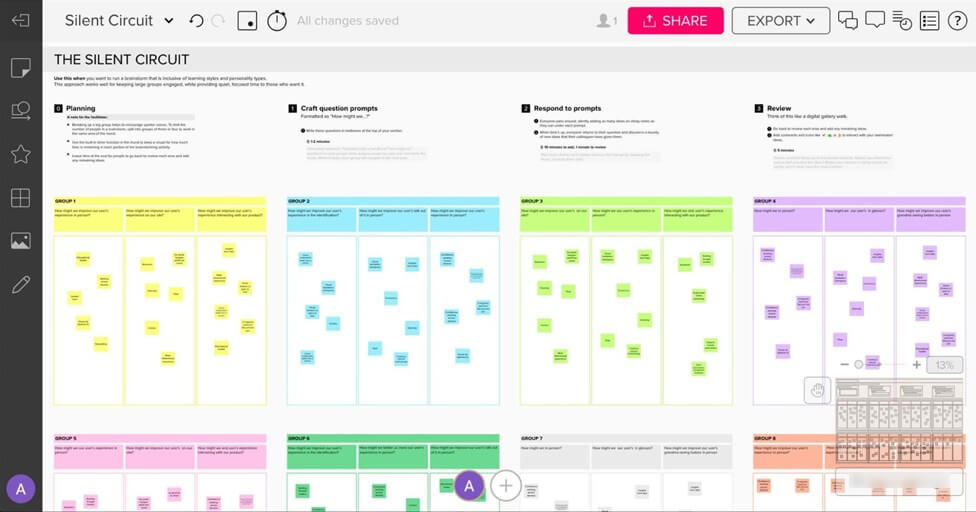
One of the Mural Template
Presentation tools
As a bonus, Mural provides a means to make presentations that stand out and are remembered long after they have ended. You have a ton of freedom in designing your sheets with this tool. The integrated shape and connector modules allow users to quickly and easily create diagrams and map out administrative workflows.
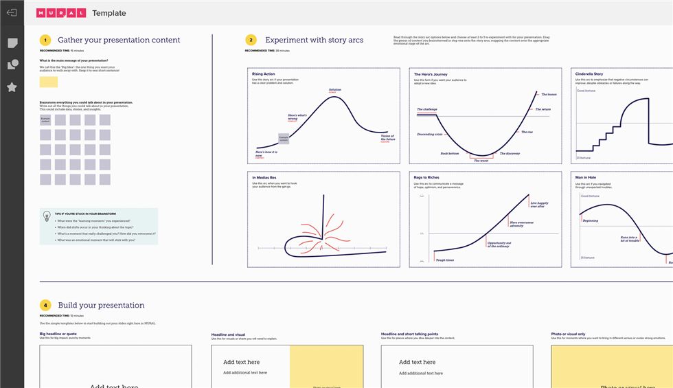
Mural Presentation
What are the Differences Between Miro and Mural?
We’ve finished both Miro’s and Mural’s walkthroughs. You may have noticed many similarities between the two, but there are also some significant differences.
So, let’s see how Miro stacks up against Mural.
1. Whiteboard Canvas
Mural has a large, non-infinite canvas, whereas Miro has an infinite one. To fit in more content, you must save space in the latter. Miro’s frames appealed more than Mural’s outline. However, when it comes to folder organization, Mural outperforms Miro because it uses a folder within a folder approach. Miro allows you to create a folder or project that contains all the boards associated with that project.
2. User-Interface
The Miro interface is much more responsive, intuitive, and easy to use. Additionally, the app is helpful for mobile board work. On the other hand, Mural’s mobile app doesn’t offer editing features and only lets you view content. With Miro, the user interface was simpler to grasp than with Mural. However, Miro also has an advanced dashboard.
3. Templates
All right, let’s move on to discussing templates. Miro enables you to make your own design from scratch or use one of the many available templates. Mural also has over 300 templates, though they need Miro’s elegance and polish and are organized into fewer categories.
4. Videocall Feature
Miro comes with a video chat feature, while Mural doesn’t have it and needs to integrate with other apps to use this feature. Unlike Miro, which facilitates teamwork via screen sharing, Mural also does not provide this functionality.
5. Privacy
Mural saves the day when it comes to a secluded private meeting on the whiteboard for the whole team. Currently, Miro lacks a private mode option.
6. Pricing
Miro’s pricing is more accommodating because it can be paid for either monthly or annually. On the contrary, Agencies considering a trial of Mural should be aware that the pricing model is limited to annual billing. It takes commitment over a long period, which is something a beginner may need more time to be ready for. Price-wise, Miro is preferable to Mural.
Is Miro or Mural Better?
There are benefits and drawbacks to both apps. There is no clear victor here, and we can’t decide. Ultimately, it comes down to the user’s preferences and needs. However, it has been founded that Miro is superior to Mural in some respects.
You can conclude from the pros and limitations of both apps.
Pros and Cons of Miro
Pros
- A digital whiteboard with unlimited storage space for your unlimited note-taking needs.
- Integrated video conferencing for more productive in-process teamwork
- Provides a user with a simple and efficient interface.
- Tons of pre-made collaboration templates like mind maps, workflows, and Kanban.
Limitations
- Costs are inaccessible for smaller organizations.
- Relatively limited offline support and functionality
- The lack of linking and tagging makes building a comprehensive knowledge hub hard.
Now, let’s see the pros and limitations of Mural:
Pros and Cons of Mural
Pros
- Infinite whiteboards that can support a wide variety of file types.
- Templates can be customized, and ideas can be freely exchanged.
- Excellent whiteboard features for group work
Limitations
- No integrated video chat feature.
- You can’t make your own interactive graphs, tables, or reports.
- More expensive than similar offerings from competitors
- For many first-time users, the interface is very complex
Final Words
Different from each other, both Miro and Mural have their own strong points. This blog shows that Miro has many features to communicate and collaborate with team members. At the same time, Mural is more focused on making it easier to record the meeting notes and let them circulate in your company. The two products will be a different choice for us depending on our needs and purposes.
Leave your thoughts in the comments if you have experience with either of these two platforms.

