In the world of YouTube Shorts, where videos are limited to 60 seconds, every aspect is crucial in capturing and retaining audience attention. One crucial aspect that often goes overlooked is the font choice. The right font can significantly enhance the readability, brand identity, and overall impact of your video. In this article, we’ll explore the importance of selecting the perfect font for your YouTube Shorts and provide you with a comprehensive guide to help you make the best choice.
The Best Fonts for YouTube Shorts
Table of Contents: hide
Factors to Consider When Choosing a Font
Pairing Fonts for Maximum Impact
Factors to Consider When Choosing a Font
Before diving into the top font choices for YouTube Shorts, it’s crucial to understand the key factors that should influence your decision. These include:
- Readability: Your chosen font should be easily readable on various devices and screen sizes. Opt for clear and legible fonts, even when displayed in smaller sizes.
- Brand consistency: If you have a well-established brand, consider using fonts that align with your brand identity. Maintaining consistency in your videos helps build recognition and trust with your viewers.
- Emotional impact: Fonts can evoke emotions and set the tone for your content. Choose a font that complements the mood and message you want to convey.
- Compatibility: Ensure that your selected font is compatible with the software and devices you use to create and edit your YouTube Shorts.
Top Fonts for YouTube Shorts
Now that you know what to look for in a font, let’s explore some of the best options for YouTube Shorts:
Komika Axis
Komika Axis is a bold and dynamic display font that has gained popularity among YouTube content creators, particularly for use in YouTube Shorts. Its hand-drawn, irregular letterforms and energetic style make it an excellent choice for captivating viewers and injecting a sense of fun and enthusiasm into your videos. The font’s quirky and playful nature works well with the fast-paced and entertaining content often found in YouTube Shorts. Notable YouTubers, such as Mr. Beast, have utilized Komika Axis in their thumbnails and video titles to attract viewers and stand out in the competitive online video content market.
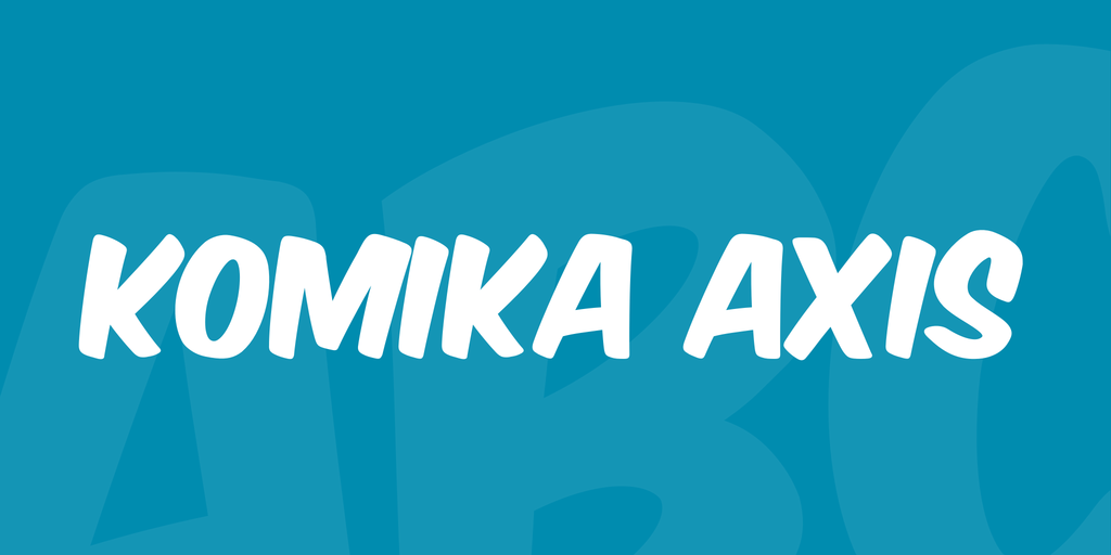
Top Fonts for YouTube Shorts – Komika Axis
Arial
A classic and widely used font, Arial is known for its simplicity and readability. It has a clean, modern design that works well for various content styles. Arial’s versatility makes it a safe choice for most YouTube Shorts, as it maintains legibility across different screen sizes and devices. Its neutral appearance allows your content to take center stage without the font being a distraction.
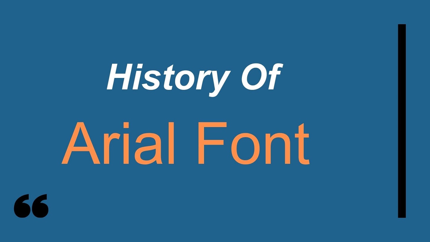
Top Fonts for YouTube Shorts – Arial
Helvetica
Similar to Arial, Helvetica is a clean and versatile font that works well for various content styles. Helvetica was developed in 1957 and became a staple in the design world due to its timeless and professional appearance. Its slightly more rounded characters give it a friendlier vibe compared to Arial, making it a great choice for YouTube Shorts that aim to establish a more approachable brand identity.
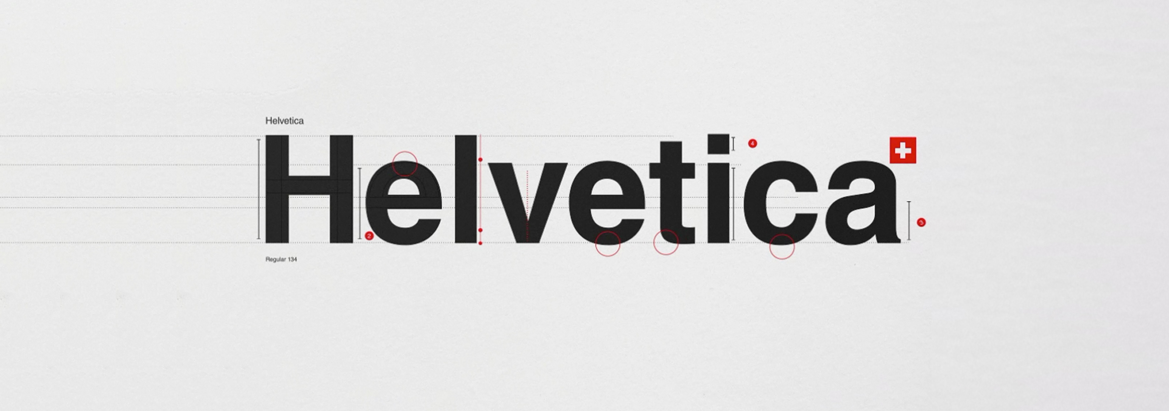
Top Fonts for YouTube Shorts – Helvetica
Roboto
Developed by Google, Roboto is a modern sans-serif font with excellent digital screen readability. Its clean lines and geometric shapes make it popular for web and mobile interfaces. Roboto’s readability remains strong even at smaller sizes, making it an ideal font for YouTube Shorts viewed on mobile devices. Its modern appearance aligns well with tech, lifestyle, and educational content.
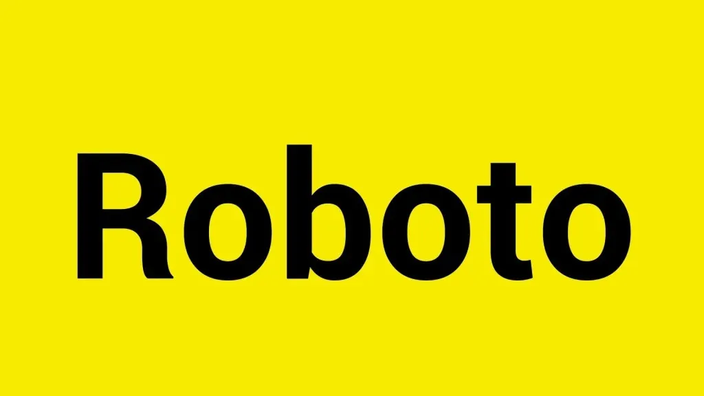
Top Fonts for YouTube Shorts – Roboto
Montserrat
With its geometric design, Montserrat is a stylish font that adds a touch of sophistication to your YouTube Shorts. Inspired by urban typography, Montserrat’s unique combination of rounded and sharp characters gives it a distinct personality. Its bold and confident appearance is perfect for fashion, beauty, and creative industry-related content. Montserrat is also highly legible, ensuring your message remains clear and easy to read.
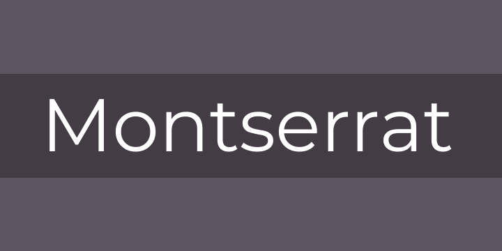
Top Fonts for YouTube Shorts – Montserrat
Georgia
A timeless serif font, Georgia is renowned for its elegance and readability. Georgia’s large x-height and generous spacing between characters make it easy to read even at smaller sizes, designed specifically for digital screens. Its classic appearance lends a sense of credibility and sophistication to your YouTube Shorts, making it an excellent choice for more traditional or educational content such as news, history, or educational videos.
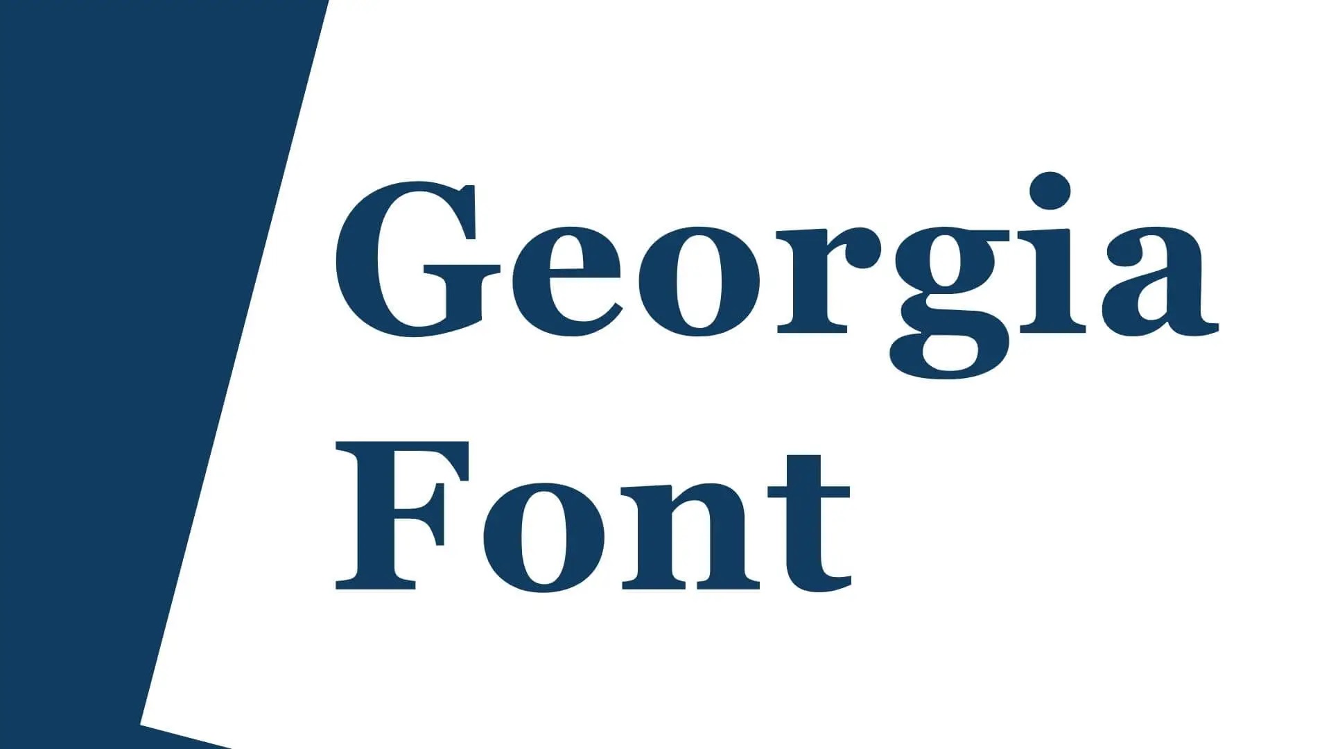
Top Fonts for YouTube Shorts – Georgia
Merriweather
Designed for online reading, this versatile serif font is great for both headers and body text. Its slight contrast in stroke thickness and moderate x-height make its excellent readability on digital screens. Merriweather’s warm and inviting appearance makes it a great choice for content that aims to create an emotional connection with the viewer, such as personal stories, lifestyle vlogs, or inspiring videos.
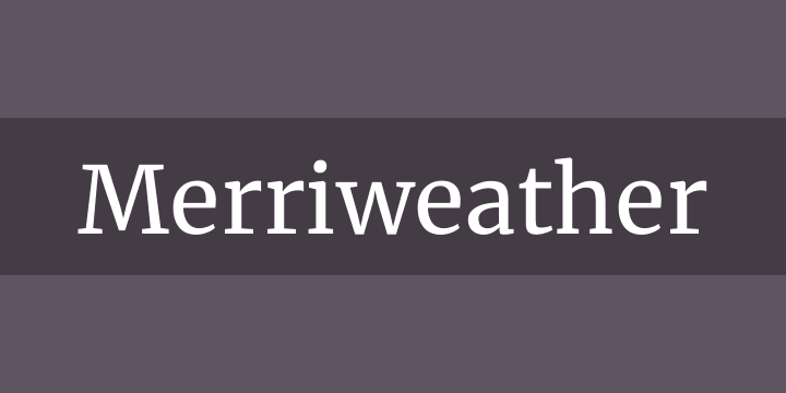
Top Fonts for YouTube Shorts – Merriweather
Display fonts
Bebas Neue: Bold and attention-grabbing, Bebas Neue is perfect for titles and headlines in your YouTube Shorts. Its strong, condensed letterforms grab attention and make a powerful impact. Bebas Neue’s all-caps design adds a sense of urgency and excitement to your text, making it ideal for action-packed, high-energy content such as sports, fitness, or adventure-related videos. Use Bebas Neue sparingly to maintain its impact and avoid overwhelming your viewers.
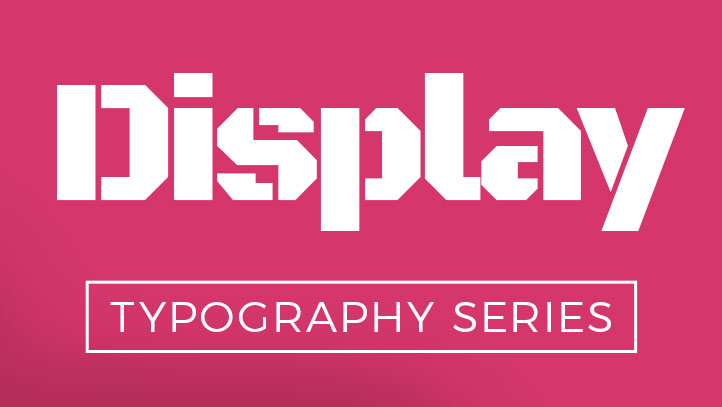
Top Fonts for YouTube Shorts – Display Fonts
Lobster
With its playful and decorative style, it adds fun and creativity to your videos. Its flowing, brush-like strokes give it a unique and recognizable appearance that sets it apart from more traditional fonts. Lobster is an excellent choice for YouTube Shorts related to food, travel, or arts and crafts, as its whimsical nature complements these themes. However, due to its decorative nature, it’s best to limit Lobster to short phrases or titles to maintain readability.
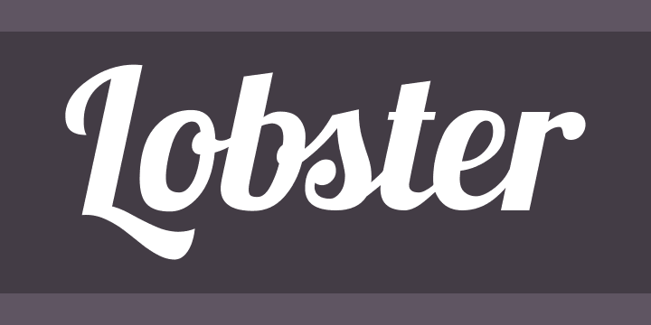
Top Fonts for YouTube Shorts – Lobster
Pacifico
A friendly and casual script font, Pacifico is ideal for lifestyle or entertainment-related content. Its flowing lines, reminiscent of handwritten text, add a personal and approachable touch to your YouTube Shorts. Pacifico’s informal appearance suits it for content such as beauty tutorials, cooking videos, or personal vlogs. As with most script fonts, it’s essential to use Pacifico sparingly and at larger sizes to ensure readability on various devices.
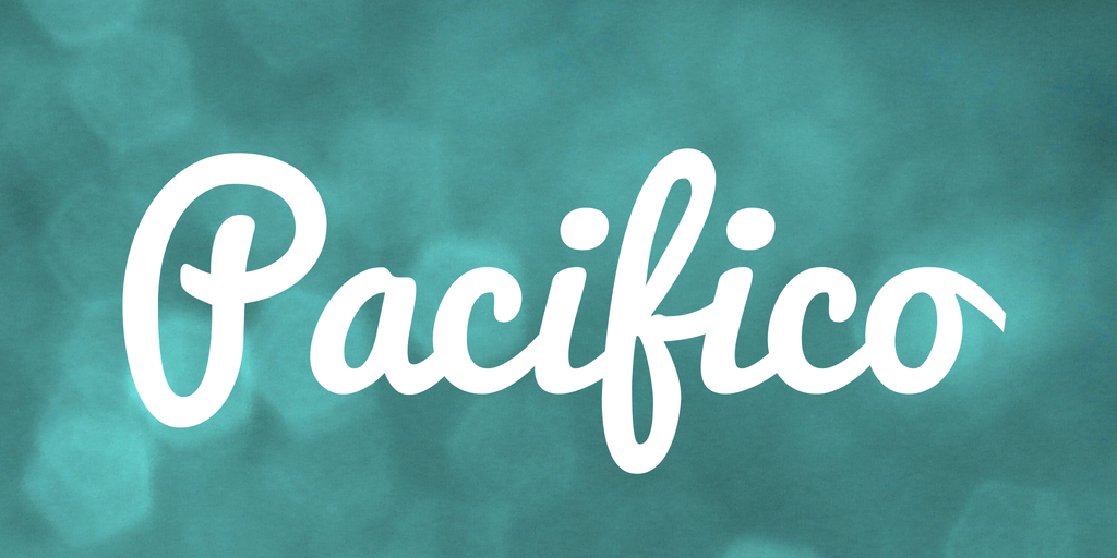
Pacifico
Pairing Fonts for Maximum Impact
While it’s crucial to choose the right font for your YouTube Shorts, pairing fonts effectively can enhance the visual appeal of your video. Here are some tips for combining fonts:
- Combining sans-serif and serif fonts: Pairing a sans-serif font for headers with a serif font for body text creates a balanced and visually interesting look.
- Using display fonts for emphasis: Incorporate display fonts sparingly to highlight important text or add a decorative touch to your YouTube Shorts.
- Maintaining readability and visual hierarchy: When pairing fonts, ensure that the combination doesn’t compromise readability. Visual hierarchy can be established by using different font sizes and weights.
Tips for Implementing Fonts in YouTube Shorts
To make the most of your chosen fonts, consider these tips when incorporating them into your YouTube Shorts:
- Choosing the right font size: Ensure that your text is large enough to be easily readable on mobile devices. A minimum font size of 24 pixels is generally recommended.
- Ensuring proper color contrast: To enhance readability, select font colors that contrast well with your video’s background. Avoid using colors that clash or make the text difficult to distinguish.
- Limiting the number of fonts used: Stick to a maximum of two or three fonts in your YouTube Shorts to maintain a professional and cohesive look.
- Testing fonts on various devices: Before finalizing your font choices, test how they appear on different devices and screen sizes to ensure optimal readability.
Bonus Tip. How to Add Best Fonts to YouTube Shorts?
Adding appealing fonts to your YouTube Shorts can significantly enhance viewer engagement and make your content stand out. While YouTube Shorts currently has limited native options for custom fonts, you can use third-party tools like CapUp to add popular subtitles to your YouTube Shorts and go viral on YouTube Shorts.
Simply log in to CapUp and make videos with the best captions like – MrBeast, Ali Abdaal, Alex Hormozi, and Iman Gadzhi.
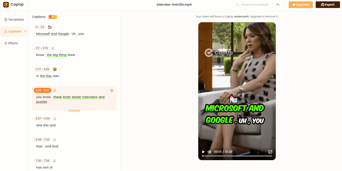
How to Add Best Fonts to YouTube Shorts
Conclusion
Selecting the right font for your YouTube Shorts is a crucial step in creating engaging and impactful videos. You can choose fonts that elevate your content and captivate your audience by considering factors such as readability, brand consistency, and emotional impact. Keep experimenting with different font combinations and styles to find what works best for your specific niche and target audience.
