In recent times of evolution and online business, people are trying to attain the information to hone their skills and upscale their businesses. With a smartphone and excessive use of technology devices in every hand, businesses have a very fair chance to upscale their game. However, doing so requires good research and implementation skills. It is not easy, but new incoming designs and trends make the journey a little easier.

Learn About Adaptive Web Design
Considering this, we will introduce you to a new web design named adaptive web design. Among many website designs, this is tailored to smartphones and every device you can potentially use to open a website to shop or do more. It facilitates the user in the best way possible and ensures an engaging user experience. Please keep reading to uncover more amazing facts about this design.
Table of Contents: hide
What Is Adaptive Design in Web Design?
What Are the Differences Between Responsive And Adaptive Web Design?
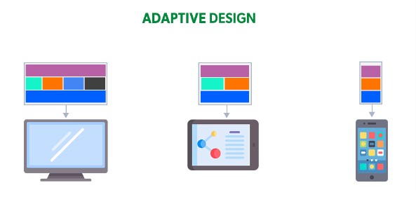
What Is Adaptive Design in Web Design?
Adaptive web design is based on creating different versions of the same website to let users access it irrespective of their device. The layout, needs, modal, and requirements of the website’s display are predefined and do not adapt according to the device; instead, the designing process considers all the devices beforehand. Moreover, this type of design brings a more user-friendly experience.
What Is Adaptive Design in Web Design
The designers first acknowledge the basic requirements of the device and browsers and then work to create multiple versions of a single website following them. It takes work, effort, and time but the result is worth it. Now that we know a little about adaptive design, it is time to discover the differences between this design and responsive web design. We will also learn about its promising benefits and how to create them in this article. Please stick with us to learn more about adaptive web design.
What Are the Differences Between Responsive And Adaptive Web Design?
Suppose you want to equip yourself with the difference between Responsive and Adaptive web design. Let us start this journey with the basics. First, we will learn what exactly responsive design is and then move towards knowing the difference between both. Since we have already gone through the basic concept of adaptive design, knowing more about it isn’t necessary.
Differences Between Responsive And Adaptive Web Design
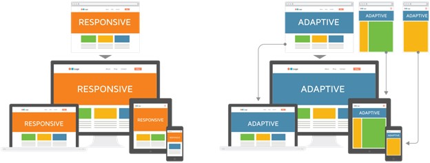
As the name suggests, responsive web design consists of a design that caters to and responds to the user’s requirements. In this concept, the design caters to the screen used for the website, irrespective of whether the device is a laptop, tablet, computer, etc. Responsive web design and adaptive web design are two methods to craft a website.
The main difference lies in their design at the ground level, which is responsive, flexible, and accommodating to the user’s screen size. At the same time, adaptive web design has a more fixed approach with a well-defined layout. Crafting a responsive web design is extensive compared to adaptive web design. You can opt for either, depending on your requirements for a website.
What Are The Benefits Of Adaptive Web Design?
This design provides you with a greater command of user experience. Let us discover more about the benefits and magic of using an adaptive design by going through the ones mentioned below:
✔️ Optimize User Experience
Adaptive web design focuses on providing a smooth user experience. Various versions of a single website are tailored according to the devices. It ensures layouts that keep the user hooked by satisfying their visual needs and honing their experience.
✔️ Faster Loading Duration
Since the design is created for each device separately, the time to load the site is increased. At the same time, using other designs that may take a while to tailor according to the user’s device before display, load time increases, which might negatively influence the user. With this design, the site loads quickly, and content is shown, keeping the user engaged for a long time.
✔️ Wider Audience
With an adaptive design, your website works well on all devices. The users don’t have to face trouble accessing it regardless of their device. It encourages a website to reach more customers and build a wider loyal customer base.
✔️ Save Cost and Helps You Stay on Budget
Running a business and maintaining a website requires money; sometimes, renewing an entire website can be hard. It is where you can apply this design easily because it can be done on an already present site. If your site needs modifications in the code, you can accomplish it without disturbing the entire site. It is a win-win situation.
How To Create an Adaptive Web Design?
Now it is time to master creating adaptive web design. What are the basic prerequisites and things we require to achieve this goal? In this paragraph, we will discuss everything in detail. Keep reading.
✔️ Know Your Audience and Their Technology Use
To achieve success in the online world, having a deep knowledge of your user and their habits carries significant importance. Dive in and learn, what devices they use hypothetically, and obtain basic information about it.
✔️ Focus On Typography
Font plays a major role in the delivery of content. Pay special attention to using fonts based on a responsive font system. It will help in adapting according to the size of the device screen. Use common and easily available fonts supported by most devices.
✔️ Focus On Visual Content
Visual content keeps the users hooked, adding responsive images so they display adequately on various devices.
✔️ Integrate Iteration
Actively work on areas that ask for improvements and iterate the website. It entails a good impression, and users are more likely to use sites that consider their requirements to make them better.
To design a standard adaptive web design, you must cover the following aspects:
- Prototype design with fast prototyper like Axure, Mockplus,
- UI/UX design
- Front-End development: HTML, CSS, JS.
- Back-End development: Java, PHP, Ruby, etc.
Let us discuss the three simple steps to acquire an adaptive web design.
Step 1. Meta Tags
Meta tags hold the utmost importance. Most smartphone browsers run the HTML page in a larger viewport width to cater to the screen size.
For example, here is a meta tag that explains that the viewport is equivalent to the device’s screen:
<Meta name = “viewport” content = “width = device-width, initial-scale = 1.0”>
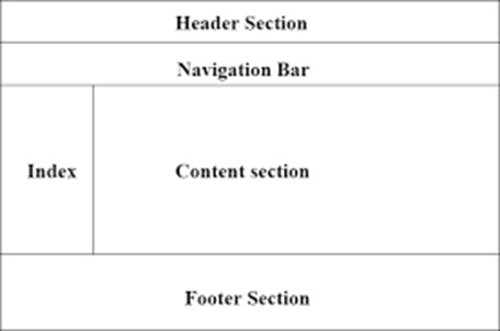
Step 2. HTML Layout
The page layout and structure are considered on every screen. It usually varies depending on the device. An HTML structure consists of Header, Content, Sidebar, Footer, links, headings, etc.
HTML Layout
Final Thought
In this article, we shed light on the concept of adaptive web design and how it works. Moreover, we learned some brief insight into adaptive web design and the basic difference between this design and responsive web design. A good deal of benefits and ways of creating it were also talked about. We hope this was a good read and this article helped you to learn a thing or two about adaptive design. Always remember that adapting to modification and applying necessary steps to improve a website is a wise decision. Let us know if you have any queries, comment them down, and we will try our best to assist you.