Design and technology significantly impact our daily lives in the modern world. They influence the products we use and the online environments we visit. As technology advances, there is an increasing focus on making sure these designs are usable by everyone. Accessibility design can help with that. It all comes down to constructing inclusive experiences and dismantling obstacles so those with disabilities can easily use technology. Following specific guidelines and practices in accessibility design enables people with disabilities to view, comprehend, and use products without hindrances.
These patterns act as frameworks and guidelines for designers and developers, assisting them in seamlessly integrating accessibility features into their works. This article will highlight the top 12 accessible design examples. Each pattern will be examined deeply, emphasizing its salient characteristics, advantages, and practical applications. By comprehending and putting these patterns into practice, we can promote greater accessibility and enable people of all abilities to fully engage in the digital landscape, so without further ado, let us explore these remarkable design strategies.
Table of Contents: hide
What is Accessibility in UX Design?
What Are the Five Types of Accessibility?
What is Accessibility in UX Design?
Wondering what is Accessibility design? Look no further! Before diving into any project, doing some thoughtful design work is important. This initial step sets the stage for success. By dedicating time to brainstorming ideas, designers and developers can get on the same page, anticipate potential issues, and ensure a smooth implementation process. User Experience – UX design plays a vital role in this process. Besides this, it helps developers transform their ideas into well-designed solutions that meet user needs, fulfill their expectations, and create a solid foundation for a successful project.
There are many different design patterns in the field of user experience design, and accessible design patterns are a significant subset of these patterns. The goal of accessible design patterns is to include people with disabilities in digital experiences and platforms. For incorporating accessibility features into the design and development process, they offer recommendations and best practices. It guarantees barrier-free access to and interaction with digital content for people with visual, hearing, motor, cognitive, or other disabilities. This helps the developer write the code that fits the need.
What Are the Five Types of Accessibility?
Wondering what are the types of accessibility? You have come to the right section! There are five types of accessibility which are mentioned below:
🚩 Visual Accessibility
Visual accessibility ensures that individuals with visual impairments can retrieve content and information. It can be achieved through various methods. For instance, providing text descriptions for images, graphs, and charts allows visually impaired users to understand the visual content with the help of screen readers. Another approach is to enhance contrast by using distinct colors for text and background, enabling individuals with low vision to read the information more easily.
🚩 Motor/mobility accessibility
The goal of motor/mobility accessibility is to make it easier for people to move around and interact in both physical and digital environments. It entails taking usability and accessibility into account. For instance, keyboard accessibility makes sure that all features and content can be accessed and used without the need for precise mouse movements using just a keyboard. Besides this, users can use voice commands to interact with interfaces, eliminating the need for physical input.
🚩 Auditory accessibility
Making content and information accessible to those who are deaf or hard of hearing is the main goal of auditory accessibility. Various methods can be used to increase auditory accessibility. Transcripts and captions for audio and video content are one strategy. These captions or transcripts allow people with hearing loss to read what is being said. Another tactic is to convey critical information by using visual cues in place of, or in addition to, audio alerts. This ensures that those who are deaf can still comprehend the message through visual cues.
🚩 Seizure Accessibility
Seizure accessibility aims to reduce the possibility of causing seizures in people with photosensitive epilepsy or other seizure disorders. Considerations should be made to accomplish this. Avoiding content that has fast-flashing or quickly-changing visuals with high-frequency flashes is important because these could potentially cause seizures. Besides this, alerting users to content containing flashing or seizure-inducing elements is critical. People are then able to decide for themselves whether or not to engage with the content in question.
🚩 Cognitive/Learning Accessibility
Making information and user interfaces easier to understand and use for people with cognitive impairments or learning disabilities is the focus of cognitive accessibility. There are many ways to increase cognitive accessibility and learning. One strategy is to speak plainly and succinctly, avoiding jargon or terms that could be difficult to understand. Information can also be arranged logically and systematically using headings, bullet points, and lists to aid understanding. Besides this, incorporating visual cues and aids, such as icons or illustrations, can help clarify information.
Top 12 Accessible Design Examples
Are you looking for the best accessible design examples? You have come to the right section, as it will provide the top 12 ideal accessible design examples which you can utilize while designing your next project, so let us not wait anymore and jump directly into the examples:
High-contrast Visual Impact
High-contrast visual impact is a design strategy that employs striking contrasts in color or brightness to produce an eye-catching final product. By using contrast to its full potential, designers can draw viewers in and make their work stand out. Besides this, high-contrast designs have the potential to be powerful, arresting, and aesthetically pleasing, grabbing the attention of the audience and leaving a lasting impression. Designers can create designs with a strong visual presence and engage viewers with the content by using contrast in the right way.
High-contrast Visual Impact
Key features and benefits:
- Better accessibility and inclusivity.
- Improved user experience.
- Enhanced visibility.
- Easier to navigate
Target users:
- Individuals with visual impairments
Introduce Table of Contents
Are you looking for an example that involves organizing the information? Let us help you! A table of contents on a website with a lot of information can assist users in retrieving and accessing particular pages. Designers can make it easier for all users, including those with disabilities, to navigate the website and enhance the overall browsing experience by using a table of contents.
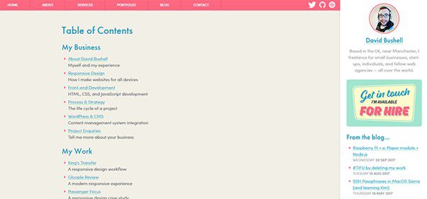
Introduce Table of Contents
Key features and benefits:
- Improved Accessibility.
- Enhances hyperlinked navigation.
- Sticky or absoluteposition
- Organizing the information.
Target users:
- Individuals who rely on screen readers.
Control Using the Keyboard
Looking for a design example that involves keyboard usage? You are at the right place! An essential component of accessible design is controlling the keyboard, which enables users to navigate and interact with digital interfaces without depending on precise mouse movements and offers numerous key features.
Control Using the Keyboard
Key features and benefits:
- Accessible focus indicators.
- Keyboard shortcuts.
- Bypassing links.
- Chronological navigation
Target users:
- People with mobility issues or motor disabilities.
Control Scrolling Content
An essential accessibility consideration that can significantly enhance user experience is allowing users to pause scrolling content. It allows users to manage their interaction with a website’s dynamic or automatically scrolling elements. Besides, it prevents users from feeling hurried or overloaded as they read, view, or interact with the content.
Control Scrolling Content
Key features and benefits:
- Pause button or control.
- Keyboard accessibility.
- Facilitates Content Consumption.
- Improved User Contro.
Target users:
- Individuals with cognitive disabilities.
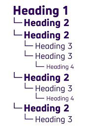
Right HTML Tags
For the organization of the content on the web and accessibility, headings in HTML markup must be properly identified. You can improve your web pages’ readability, navigation, and overall user experience by structuring and identifying headings with the appropriate HTML tags. As a result, the platform is better organized and simpler to use.

Right HTML Tags
Key features and benefits:
- Correct heading hierarchy.
- Throughout consistency.
- Styling flexibility.
- Improved SEO.
Target users:
- Individuals who rely on assistive technologies.
Real-time Suggestions and Corrections
When designing for accessibility, you must consider the abilities and needs of all users, even those who might make mistakes or errors when interacting with your website or application. You can help users when they enter inaccurate or invalid information by implementing error suggestions and correction features.
Real Time Suggestions And Corrections
Key features and benefits:
- Context-aware suggestions.
- Efficient Data Entry.
- Improved accessibility.
- Avoids misleading.
Target users:
- Individuals seeking smooth user experience.
Proper Naming Conventions and Headings
The purpose and content of a web page are best communicated to users through the page titles. They act as the user’s first point of contact, giving them a sense of what to expect from the page. However, it is crucial to ensure the titles are accurate and compelling, so do not let deceptive page titles sabotage your users’ experience and ensure that every click leads to the useful content it should come from the outset.
Proper Naming Conventions and Headings
Key features and benefits:
- Improved User Engagement.
- Better SEO.
- Removes ambiguity.
- Promotes a sense of relevance.
Target users:
- Individuals with visual impairments.
Make Use of Alternative Text
Alt text, short for alternative text, is important to web accessibility. It provides a written description of each image on a webpage. By including alt text, you ensure that people who use screen readers or have visual impairments can comprehend the images’ content and meaning. So, remember to add alt text to your images to assist all users in understanding how to engage with your content.
Make Use of Alternative Text
Key features and benefits:
- Provides a better understanding of the picture context.
- Boosts SEO.
- Enhanced accessibility.
- Highlights the purpose.
Target users:
- Users with blindness.
Incorporate Breadcrumbs
Websites frequently use breadcrumbs as a navigational tool to improve user experience and give users clear paths to follow back to previous pages. They serve as a visual trail, indicating to users where they are concerning the website’s hierarchy.
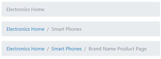
Incorporate Breadcrumbs
Key features and benefits:
- Dynamic updates.
- Enhancesuser experience.
- Simplifies site exploration.
- Clear hierarchy display.
Target users:
- Individuals exploring large websites with nested pages.
Adding Accessibility Toolbar
An accessibility toolbar is a user interface component that offers a selection of tools and options to enhance a website’s or digital application’s extractability. Besides this, it aims to improve the content’s usability and accessibility for users with various needs or disabilities.
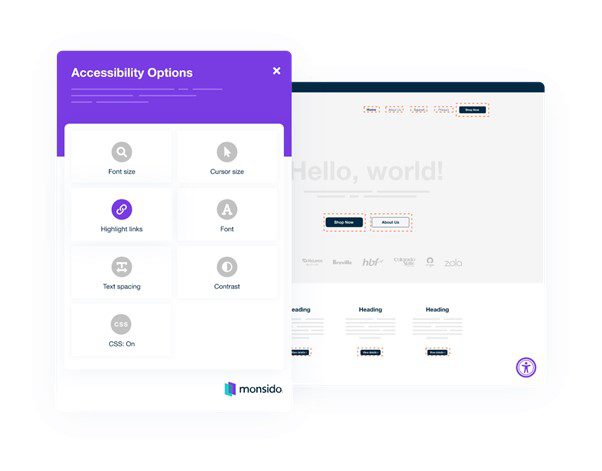
Adding Accessibility Toolbar
Key features and benefits:
- Allows customization.
- Inclusive design.
- Offer color contrast customization.
- Keyboard navigation enhancements.
Target users:
- Individuals with motordisabilities
Inclusion of Micro-interactions
Micro-interactions are small interactive elements that make digital interfaces more user-friendly and appealing. They play a potent role in improving the overall user experience by providing feedback and visual cues. For instance, when you click a button, and it responds with animation or a change in appearance, that is a micro-interaction.
Key features and benefits:
- Improved Usability.
- Accessible Design.
- Hover Effects.
- Sound Effects.
Target users:
- Individuals with cognitive disabilities.
Using Bigger Fonts
A good design strategy to improve the accessibility and readability of digital content is to increase font size. Users with visual impairments or who prefer larger text can comfortably consume information by making text larger and more noticeable. In short, big and bold, larger fonts make content shine and accessibility align.
Using Bigger Fonts
Key features and benefits:
- Better
- Beneficial for mobile users.
- Enhances visual hierarchy.
- Responsive design
Target users:
- Individuals with low vision.
How Does Accessible Design Help Everyone?
Wondering what are the benefits of incorporating accessible design? Look no further, as we have compiled a list of advantages of how it helps users, so let us jump into it:
User satisfaction
One of the main advantages of applying accessible design principles is improved user experience. Inclusion and usability are improved for all users, regardless of abilities or disabilities, when websites and applications prioritize accessibility. Think of a website, for instance, that uses accessible design elements like descriptive headings, appropriate use of alt text for images, and simple navigation. Because screen readers can interpret headings and provide descriptions for images, these design elements help users with visual impairments navigate the website more easily.
Increased readability
The accessible design provides an improved readability experience. Websites and applications can be made more readable and user-friendly for all users, regardless of their visual preferences or abilities, by implementing techniques like using high-contrast colors and larger fonts. It ensures that text stands out against the background clearly for people with low vision or visual impairments, making it simpler to perceive and read. This can involve using dark text on a light background or vice versa to make a distinct contrast.
Device Adaptability
Websites and apps that prioritize accessible design make sure that users can access and use their content on any device, like computers, laptops, tablets, or smartphones. This is important for people who switch between different devices during the day. It allows them to move from one device to another without losing access to important information or features. Besides this, the accessible design also benefits users mainly using mobile devices. It ensures they can easily navigate and interact with the content without problems.
Final Thought
The use of these accessible design principles makes websites and applications more inclusive, user-friendly, and intuitive, ensuring that people with disabilities can easily access and interact with digital content. In this article, we have looked at the top 12 ideal accessible design examples, examining various facets of accessibility. Along with this, we also emphasized a few of the many advantages it provides. Please share it with your friends if you find it useful, and feel free to comment below.