User experience (UX) design is crucial in creating engaging and meaningful digital product and service experiences. By understanding users’ needs, behaviors, and goals, UX designers aim to create interfaces and interactions that are intuitive, efficient, and enjoyable. The ultimate goal of UX design is to enhance user satisfaction and loyalty and improve the usability and accessibility of products, all of which contribute to business growth and success.
However, not all UX design is created equal, including dark patterns. These patterns manipulate users into taking actions they did not intend to take or do not understand the consequences. There are various dark patterns, including friend spam, bait and switch, hidden costs, privacy suckering, and many more. In this article, we will explore the dark patterns in UX design, how they work, their impact on user trust and satisfaction, and how to identify and avoid them. So, stay with us to learn more about the types of dark patterns in UX design.
Also read: How to Design a 3d Model for Printing? >
Table of Contents: hide
Definition of Dark Patterns
Dark patterns are an unethical practice in UX design that aims to deceive users and manipulate their behavior. It involves using tricks and manipulative tactics to push users into taking actions they may not have intended or did not fully understand the consequences of. The consequences of dark patterns in UX design can be severe for users and businesses regarding customer acquisition and retention. For example, a website that makes it difficult to unsubscribe from a service or uses misleading wording to encourage users to share personal information would be considered a dark pattern.
Dark patterns deceive users and erode their trust in the product or service, leading to negative consequences for the user and the business. Users may feel frustrated, annoyed, or even violated, which can result in negative word-of-mouth, decreased customer loyalty, and a damaged reputation for the business. As such, UX designers must avoid using dark patterns in their designs and instead prioritize transparency, honesty, and ethical practices. By doing so, designers can build user trust, improve user satisfaction and loyalty, and ultimately drive business growth and success. Now, let us dive into the types different types of dark patterns.
Definition Of Dark Patterns
Some Common Types of Dark Patterns
The first step in avoiding the negative impact of dark patterns in UX design is to understand what they are and how they work. To better understand dark patterns, it is important first to explore the various types of manipulative tactics that designers use to deceive and manipulate users. These types include friend spam, bait and switch, hidden costs, forced action, and privacy zuckering. So let us not wait anymore and jump to the brief explanation of 10 different types of dark patterns in UX designs:
Friend spam
Friend spam is a dark pattern in UX design that encourages users to share a product or service with their friends, often without explicit consent. This dark pattern typically presents the user with a message or notification that suggests they invite their friends to try the product or service and give feedback. The message may be designed to look like a personal invitation from the user, but in reality, it is automated and sent to all of their contacts without their knowledge. Friend spam can be harmful because it can damage a user’s relationship with their friends, who may feel annoyed or manipulated by the unsolicited invitation.

Example of Friend spam
Bait and Switch
Bait and Switch is a type of dark pattern in UX design that involves presenting the user with an appealing offer, such as a low price or free trial, but hiding the terms and conditions that reveal the limitations or restrictions of the offer. Once the user has committed to the transaction, the terms and conditions are revealed, and the user realizes that the offer is not as good as they thought. This can lead to frustration, disappointment, and a loss of trust in the brand. Bait and Switch can also result in financial losses for the user, who may have paid for a service or product that doesn’t meet their needs or expectations.

Example of Bait And Switch
Disguised ads
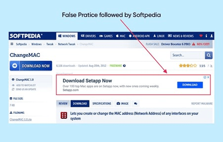
Disguised ads are a type of dark pattern in UX design that typically works by presenting advertisements in a way that appears similar to regular content, such as news articles or user-generated posts, making it difficult for the user to distinguish between what is an advertisement and what is not. It can be harmful because they can deceive users into clicking on links or engaging with content that they otherwise would not have, leading to a loss of trust and credibility in the brand, besides being frustrating for users who may feel that they are being tricked into viewing or interacting with content that is not relevant to their needs or interests.
Example of Disgusted Ads
Confirm shaming
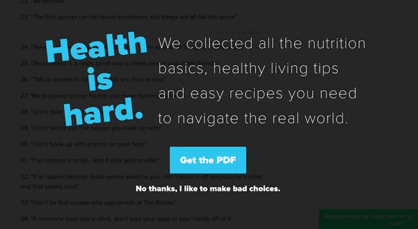
Utilizing language or design to shame a user into completing a certain action is what confirm shaming is all about! This type of dark pattern typically works by presenting the user with a confirmation prompt that appears to be giving them a choice, but the language used in the prompt is designed to make the user feel guilty or embarrassed if they choose not to take the desired action. It can be harmful because it can create negative emotions in the user and damage the relationship between the user and the brand.
Example Of ConfirmShaming
Hidden costs
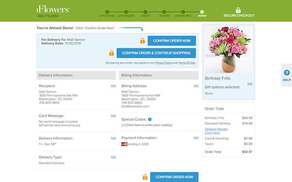
Hidden costs are a type of dark pattern in UX design that displays a lower price upfront and then adds additional charges or fees later in the checkout process. This can make the user feel like they have been deceived or misled and can lead to frustration and mistrust in the brand. Hidden costs can also result in the user paying more than anticipated, leading to financial hardship or dissatisfaction with the product or service. This type of dark pattern can be particularly harmful to vulnerable populations, such as low-income individuals or those with limited financial resources, which may be unable to afford unexpected costs.
Example of Hidden Costs
Privacy zuckering
Privacy zuckering is a type of dark pattern in UX design that presents a user with a privacy policy or terms of service agreement that is designed to be difficult to understand or intentionally vague, making it difficult for the user to fully perceive the extent to which their personal information will be collected, used, or shared. This could lead to the user unwittingly sharing more information than they intended to or agreeing to terms that they would not have otherwise agreed to if they had a clearer understanding of the implications of causing activities like data breaches and breaking users’ trust.
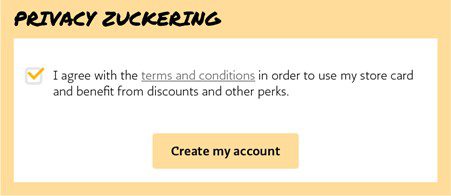
Example Of Privacy Zuckering
Misdirection
Misdirection is a dark UX design pattern that intentionally directs the user’s attention away from the desired action or information. This can be done through visual or textual cues that distract or confuse the user or by hiding or obscuring important information or options. For example, a checkout process may be designed to make it difficult for the user to cancel or modify their order. Designers must be transparent and upfront with users and avoid using manipulative tactics that undermine user experience and trust.

Example Of Misdirection
Triggering Fear
Triggering fear is a type of dark pattern in UX design by injecting fear or anxiety to manipulate the user into taking a specific action or making a particular decision. This type of dark pattern can be seen in the use of urgent messages or warnings that create a sense of impending danger or consequence or in the use of negative language or imagery that invokes feelings of guilt, shame, or inadequacy. Triggering fear can be harmful because it can lead to rash decision-making or anxiety and damage the user’s relationship with the brand if they feel manipulated or coerced.

Example of Triggering Fear
Trick questions
Trick questions are a dark pattern in UX design that intentionally confuses or misleads the user through ambiguous or deceptive language. This can be seen in using questions designed to misdirect the user’s attention or make it difficult for them to make informed decisions. For example, a website may ask a question phrased to imply a certain answer or present a series of questions that lead the user down a predetermined path. Trick questions can be harmful because they can lead to user frustration or confusion and result in unintended consequences or outcomes.

Example Of Trick questions
Sneak into basket
Sneak into the basket is a type of dark pattern in UX design that puts additional items to a user’s shopping cart or basket without their knowledge or consent. This can occur when a user completes a purchase online and is presented with additional products or services pre-selected or bundled into their cart without clear disclosure or consent. For example, a website may offer a free trial of a service but require the user to provide credit card information upfront. If the user does not cancel the trial before the end of the trial period, they may be charged for the service without their knowledge.
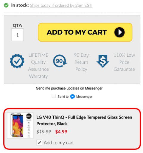
Example Of Sneak Into Basket
Reasons for using dark UX patterns
Unfortunately, some designers and businesses use dark patterns in UX design to deceive and manipulate users. These tactics can appeal to some because of their short-term gains. While these reasons might seem tempting to some businesses, they ultimately harm the user experience and can lead to a loss of trust and reputation. Designers and businesses must prioritize ethical design practices and long-term user satisfaction over short-term gains. Here are some reasons why designers and businesses might use dark patterns:
Increase sales: Dark UX patterns frequently boost sales by deceiving users into purchasing or upgrading to premium services. Unethical pricing strategies or obscured fees are commonly employed to achieve this goal, resulting in immediate profits.
Obtain user data: Dark patterns can also extract sensitive user information, including email addresses, personal data, and browsing history, which can then be used for invasive targeted advertising or sold to third parties.
Increase user engagement: Dark UX patterns can enhance user engagement by employing deceitful strategies such as fake notifications or gamification. However, this can create a false sense of interest and investment in the product or service, ultimately harming the user experience and damaging the business’s reputation.
Create a sense of urgency: Dark patterns exploit human psychology by creating a sense of urgency and scarcity, inducing users to take actions that they may not have taken otherwise. Words like “Hurry up” or “Last chance” create a “fear of missing out (FOMO)” and force users to make impulsive decisions, resulting in increased sales and profits for businesses.
Final Thoughts
In conclusion, dark UX design patterns can negatively affect users and businesses. They can erode trust, harm user experience, and damage a brand’s reputation. This article has thoroughly explained 10 different types of dark patterns and elaborated on the reasons and mindset behind their use. By understanding these manipulative tactics, users can better protect themselves from falling victim to them. If this article has helped you understand dark patterns in UX design, please share it with your friends and family to help them stay protected. We welcome your feedback and encourage you to continue learning about user experience and ethical design practices.


