The Power of Whitespace in Web Design: What Is It and How to Use It?

Visual perception is largely defined by our nature and we rarely question the way we see things. Of course, web designers and other visual professionals have to ask more pointed questions about the technical aspects of vision. For example, how to use contrasts and free space to emphasize the elements that need to draw attention immediately?
The use of whitespace is not new, yet the average consumer might not be aware of this design principle or its relevance. When it works as intended, whitespace remains in the background and the elements in its vicinity become easier to spot. It’s a very discreet technique to make any visual content better without dramatically changing its content or the basic graphic layout.
To explain the benefits of using whitespace in web design and instruct designers how to make the most of them, we tried to provide truthful and complete answers to some basic questions.
What is Whitespace in Web Design?
A well-organized web page needs to include some amount of free space between the main visual elements in order to be usable as well as navigable. When there are too many items placed too close to each other, they will be competing for attention and as a result, none will stand out. This is why some blank space needs to surround each one, reducing the visual tension and allowing the human eye to notice the details.
What is Whitespace in Web Design
Perhaps counterintuitively, whitespace doesn’t actually have to be white. It simply represents a surface in the color of the background that provides enough contrast around the edges. It can assume more or less any form, bounded only by the size and orientation of the page and its layout. Since its role is to fit around the main visual offering, it can often be in irregular shape and is best defined as the ‘in-between space’ that is perceived as empty, or simply a part of the background.
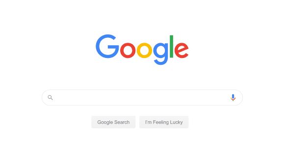
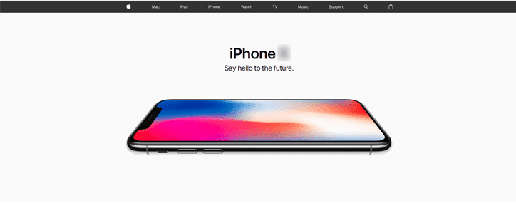
While the use of whitespace is not unique to web design, in this field it works really well due to the number of fields, text boxes, images, and other content types present on a typical webpage. Empty space helps to separate them all from one another, while the ability to endlessly increase the page through scrolling makes it easier to implement. It can be found on almost every professionally designed site, often in quite large amounts when the circumstances allow for it.
Why is Whitespace Important in Web Design?
As previously explained, the main purpose of whitespace is to make the important visual elements more visible by contrasting them and separating them from neighboring items. Web designers use it when they are deciding on the layout of each page, leaving enough of it to ensure a pleasurable user experience and easy discovery of the featured functions.
Without whitespace, a website would feel extremely crowded and different elements might be merged overlap, so it would be more difficult to discern any of them. Such a website would likely be difficult to use, particularly if it comprises a lot of content that changes often. It’s also very important that whitespace is applied consistently and distributed evenly, since a web page that is half empty on one side and full of items bunched together on the other is not very functional.
Another reason why the value of whitespace in web design is so great is the need to click on active links, which can be difficult when they are too close to each other. Interactive elements in particular need to be separated in an unambiguous way, so that the users can precisely activate them. This is why whitespace is found nearly anywhere on a typical commercial website, from the navigation menu to call-to-action boxes and downloadable documents.
Which Types of Whitespace Exist?
For simplicity, we can describe several types of whitespace that are commonly used in web design. This classification is not definite, but helps to understand the main use cases for this design technique.
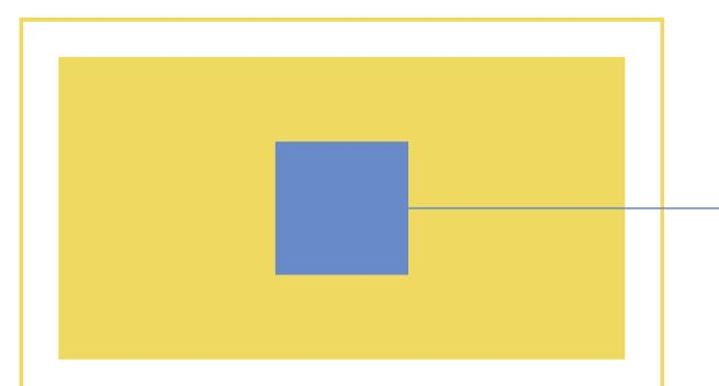
Macro whitespace
Large swaths of free space on the webpage fall into this category. These are usually found on the sides of the page, around the logo or the main image on the homepage, in between the main sections of text, and in many other places. It can be considered an integral part of the layout and should be planned during the earliest design stages.
Macro whitespace
Micro whitespace
Minor gaps between letters or lines or text, as well as around or within images can be described by this term. Micro whitespace serves simply to provide better visibility or readability of the content, and doesn’t truly factor into the overall design approach. It’s mostly added automatically during the content creation phase.
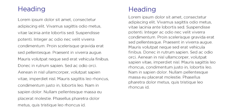
Micro whitespace
Active whitespace
This type of whitespace is intended to make the user’s journey through the website smoother and directed towards the most important functionalities. Savvy use of active whitespace improves the information flow and can affect how users interact with active links and clickable buttons, contributing to both user satisfaction and website functionality.
Active whitespace
Passive whitespace
With passive whitespace, designers are simply protecting more important visual elements from interference. It is created by placing the elements into their most natural positions and leaving enough free space for them to stay prominent.
Best Practices for Using Whitespace in Web Design
Websites are created in many different styles, but regardless of the visual identity it’s always possible to improve the user experience with some witty tricks including empty space. Some of the practices that rely on this principle include the following:
Including macro whitespace in the layout scheme
Absence of visual elements can be a part of the design style, and should always be deliberate. The largest empty surfaces need to be carefully balanced against the most prominent content sections to create a harmonious and eye-pleasing effect.
Controlling the vertical dimension
Relationships between different parts of content are often established by the location on the screen and vertical alignment. The amount of space between them plays a huge role and greatly impacts how a hierarchy between them will be perceived.
Optimizing for different screen sizes
Designers need to understand how the website will be rendered on a PC or mobile screen and use whitespace to ensure it remains usable on any device. In some cases, a separate mobile version might be created where space is in shorter supply and must be used judiciously.
Emphasizing actionable items
Whitespace should surround all important segments of a website, but it is particularly necessary for items that can be clicked on. That’s why CTA buttons, navigation links, contact forms and similar bits of content should stand alone, far enough from the nearest distraction.
FAQs about Whitespace in Web Design
Is there any difference between whitespace and negative space?
These two terms have practically identical meaning and can be used interchangeably. Both of them are actually metaphors that were coined before the digital era. Whitespace is the more commonly used expression, but most professionals will understand what you mean if you say negative space.
Can too much whitespace on a web page become a problem?
This is not necessarily a problem if it’s done intentionally, but can be impractical in some cases. Minimalist visual style demands liberal use of whitespace on large surfaces, but in web design it can leave the page looking empty and make it difficult to present multimedia content.
How to change whitespace when new items are added to the page?
Ideally, the proportion of whitespace to content should remain constant so as not to disrupt the once-established balance. That’s why it’s best to add new content to the bottom of the screen or create a completely new layout scheme that can accommodate additional items without looking too busy.
Final Words
Once you understand what whitespace is and how to look for it, you will start noticing it on every website you visit. The main difference is how skillfully it’s used and how much it contributes to the overall visual identity and the ability to find the desired functions. Since whitespace is a universal design component that can be applied in many different ways depending on the objectives and limitations, designers would be wise to study some high-end examples and develop a sense for this subtle but effective trick.