What is Wireframing in Web Design
The process of designing a complete and functional website has numerous stages, each of which depends on the success of the previous one. Before the complete content and form of every page can be decided and implemented, it’s necessary to have at least a rough idea of the broader structure and understand how pages will be grouped and connected to each other.
This structural model of a website that doesn’t yet include any content is called a wireframe. Learning what this term means and why it’s so important in web design is one of the first steps that beginners have to make before they are able to start working on serious projects. Despite its incomplete nature and the lack of real features, a wireframe is a crucially important element that needs to be developed with skill and full awareness of the website’s future functionality.
Answers to some of the most common questions about the role of wireframe in web design are provided in-depth in this article.
Explaining What is a Wireframe and What are its Benefits
As an idea for a website or web-based application is coming to life, it needs to be formalized. In particular, the creators have to decide which features will be included, which pages will exist, and how a user will move from page to page and/or activate the features. Determining these basic parameters is necessary so that all the later work would fit the intended purpose.

What is a Wireframe in Web Design
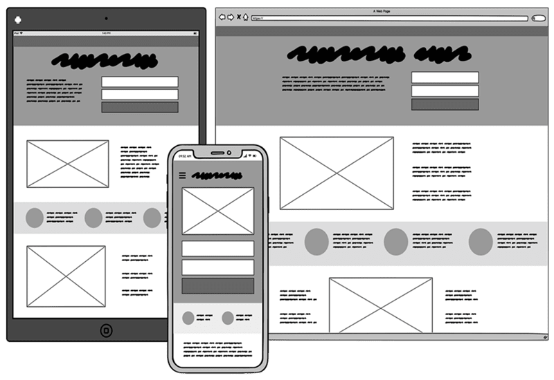
Wireframe is a rough model that includes the aforementioned elements, usually presented in a simplified visual way. Correspondently, the process of creating a website wireframe is called wireframing, and it represents one of the key skills for a web designer/developer. A well-made wireframe should ensure the usability for the final product, so it needs to be carefully constructed taking user perspective into account.
There are multiple benefits from wireframing for both the design team and the end users, including:
- Clear idea about the structural design of a website
- Presentation of the unfinished website’s functionality to others
- Opportunity to consider multiple navigation and layout options
- A wider framework upon which to base individual design decisions
- User-centric view of the project and its realization
- Convenient way to seek new workable mechanisms for key user actions
- Chance to identify any incompatibilities or inconsistencies
What Are the 2 Types of Wireframes?
Depending on the level of detail and technical sophistication, we can draw a line between two different types of wireframes. While both can be instrumental for certain projects, it’s important to understand the distinction between them:
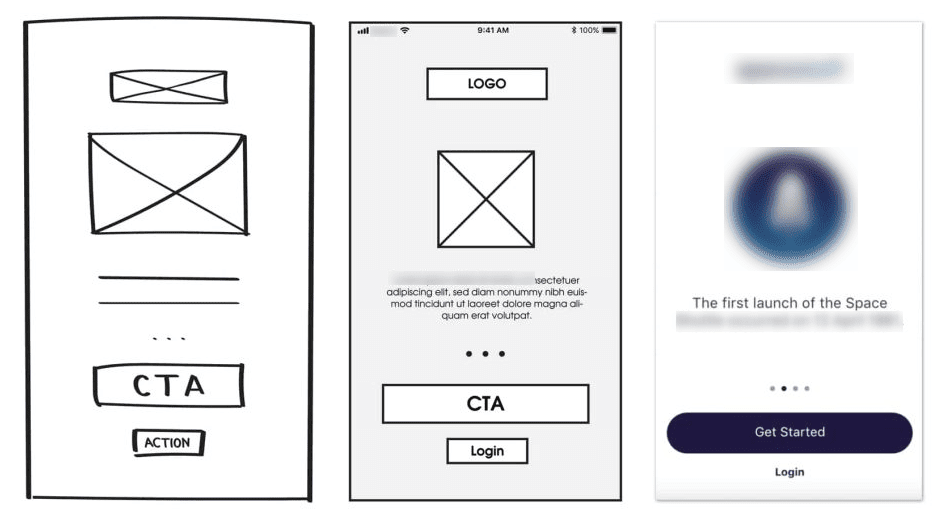
Low-fidelity wireframes
These are simple sketches that can be drawn by hand or composed with basic software and include only the most fundamental elements. Their main advantage is that they can be made very quickly, so they are commonly used in the early stages of the projects when different possibilities are still being explored and tested.
Interactive high-fidelity wireframes
On the other side of the spectrum, there are technologically advanced and visually refined hi-fi wireframes. They can include clickable elements to allow for a more faithful representation of user experience, which is why they are valuable in UX design. Logically, high fidelity wireframes require more time and effort to create.

Interactive high-fidelity wireframes
How to Create an Effective Wireframe even with Limited Technical Knowledge?
Wireframing is a fine art and can be done better with the help of an advanced software tool, but even beginners with very little knowledge can still create them. Even an imperfect wireframe is helpful for the design team, so it makes sense to create them to the best of one’s ability, either by hand or with the available visual software. Here are some tips that can be helpful.

How to Create a Wireframe in Web Design
There are three different aspects of a wireframe that require attention, including information design, interaction design, and navigation design. In other words, the key is to define how information should be routed through the site, how users can move from one location to another and find key functions, and how they can activate these functions intuitively. If all three components are sufficiently well understood and planned, it shouldn’t be hard to make a good wireframe.
A common way to start is to create a site map that includes all pages, before turning to layout of individual pages. Combining the structural and the visual aspect of a wireframe is a key step, as it helps to contextualize the task and provides the foundation for working out individual features. Starting from here, it’s not very hard to add all the elements that are worth including in the brief presentation of the website and simulate its main information flow.
In terms of technical realization, it’s OK to use any software tool for visualization that you are comfortable with. Precision and aesthetics are optional – for as long as the drawing faithfully reflects the central concepts and the proposed solutions for all practical challenges, the wireframe will serve its purpose well. While some design skills are desirable, the point is to create a clear scheme that’s easy to follow rather than for the wireframe to look beautiful or highly polished.
What are the Best Practices for Creating an Effective Wireframe?
Before you can become more proficient with wireframing, you need to learn as much as possible about this process. The experience of other web designers can provide some much needed hints, so every case study can offer some very interesting examples to draw from. Some of the most commonly used wireframing techniques that can be readily used by beginners include the following:
Initial sketching by hand
It can often be more practical to create several consecutive versions of a wireframe than to immediately aim at a perfect one, so starting from a hand-drawn model is a key time-saving trick.
Carefully choose the format and canvas size
Since the wireframe is expected to be more or less representative of the final product, choosing the right background is essential for the layout to make sense.
Color coding of key elements
The use of color can greatly improve the wireframe and allow it to present structural elements in a clear way. The colors can be tied to specific elements and used symbolically, rather than imitate the final design.
Focusing on connections more than static items
A website is a dynamic system where users can smoothly navigate between pages and functions, so all the likely paths should be defined as early as the wireframing stage.
Building upon previous versions
A low fidelity sketch can direct the early efforts before being expanded into a more comprehensive overview that supports some interaction. New wireframes are not made from scratch, but rather developed from an early illustration.
Think from the perspective of a user
Designers sometimes tend to forget that a website is not a vanity project but rather a platform that real people will use daily. Assuming the perspective of a first-time user is a good practice that makes wireframing more focused on the outcomes.
Frequently Asked Questions
How much time does it take to create a wireframe?
The simplest forms of wireframes for small websites can be created literally within minutes, especially if they are hand-drawn. On the other hand, detailed wireframes for large and complex sites can take several days or even a few weeks to develop.
Who usually creates the wireframe for a website?
Any member of the design team who understands the project well can take this responsibility. Project managers or information architects often provide guidance for its completion, but actual wireframes are most often created by web designers or developers with some visual skills.
Final Thoughts
Wireframing is a highly specific task and even the most experienced designers could probably become better at it with some preparation and learning. As new technologies arrive and raise the quality level that a new website is expected to meet, there is an even greater need to put together wireframes that inspire the whole team and simplify the implementation of the content strategy. It’s not necessary to be a technology expert or an artistic genius to be quite good in wireframing, as talented web designers who understand what a wireframe needs to accomplish could potentially learn this skill on their own.


