It’s no surprise that many folks think design is only about creativity. But the truth is we can’t ignore the rules and regulations attached to it.
Today, a lot of design techniques are packed with different rules, and one of them is the rule of thirds. The rule of thirds is guidelines that UX designers utilize to align a website’s images, texts, and other components to ensure the final version is aesthetically pleasing and effective for the target users.
If you don’t know how to use the rule of thirds in design, this guide will walk you through the important information to understand what the rule of thirds is and how to utilize it in a design process.
What Is the Rule of Thirds?
The rule of thirds is a technique used in dividing a design or image layout into a grid of nine equal-shaped boxes using vertical and horizontal lines, whereby the important elements in the design appear at the intersection of the lines or along them.
According to the rule of thirds, positioning important elements along these lines gives the image or design a more interesting composition, allowing you to have a better view.
The concept of the rule of thirds is displayed in the image below;
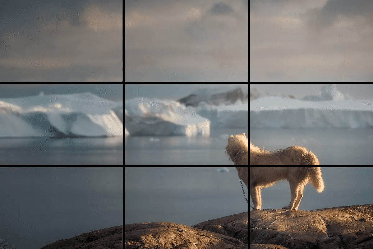
The Rule of Thirds
How is the Rule of Thirds Used in Design?
It’s very easy to use the rule of thirds in your design. All you just need is to ensure the key elements in your design are aligning with the gridlines and their intersection points.
We’ve explained three effective ways the rule of thirds is used in the design below;
Utilize the Grid as a Guidance to Organize Your Design
Not many designers are aware of this, but using the grid system in your design is a great way to organize and add structure to it. Plus, it helps you make your design cohesive and more attractive.
The different types of grid layouts include column grids, manuscript grids, baseline grids, and standard layout grids.
Column grid: Just as the name suggests, a column grid is a type of layout grid that is used to organize design elements in columns.
Column grid It is usually used in design layouts with discontinuous information. It can be used to create zones for different content on your website, magazine, blog, etc.
For example, you can use a column grid in magazines to place key texts in sections where they can be easily seen and read.
The image below is an example of a column grid;
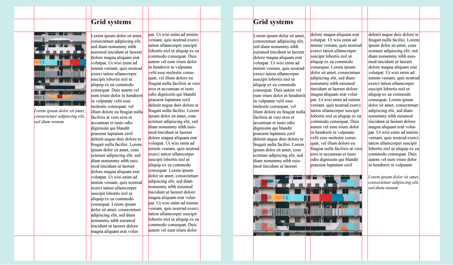
Column grid
Manuscript Grid: A manuscript grid, also known as a single-column grid is the simplest grid structure. It’s usually a large rectangular area within a design, which is used to highlight long texts and images. This kind of grid is usually used in long essays and books.
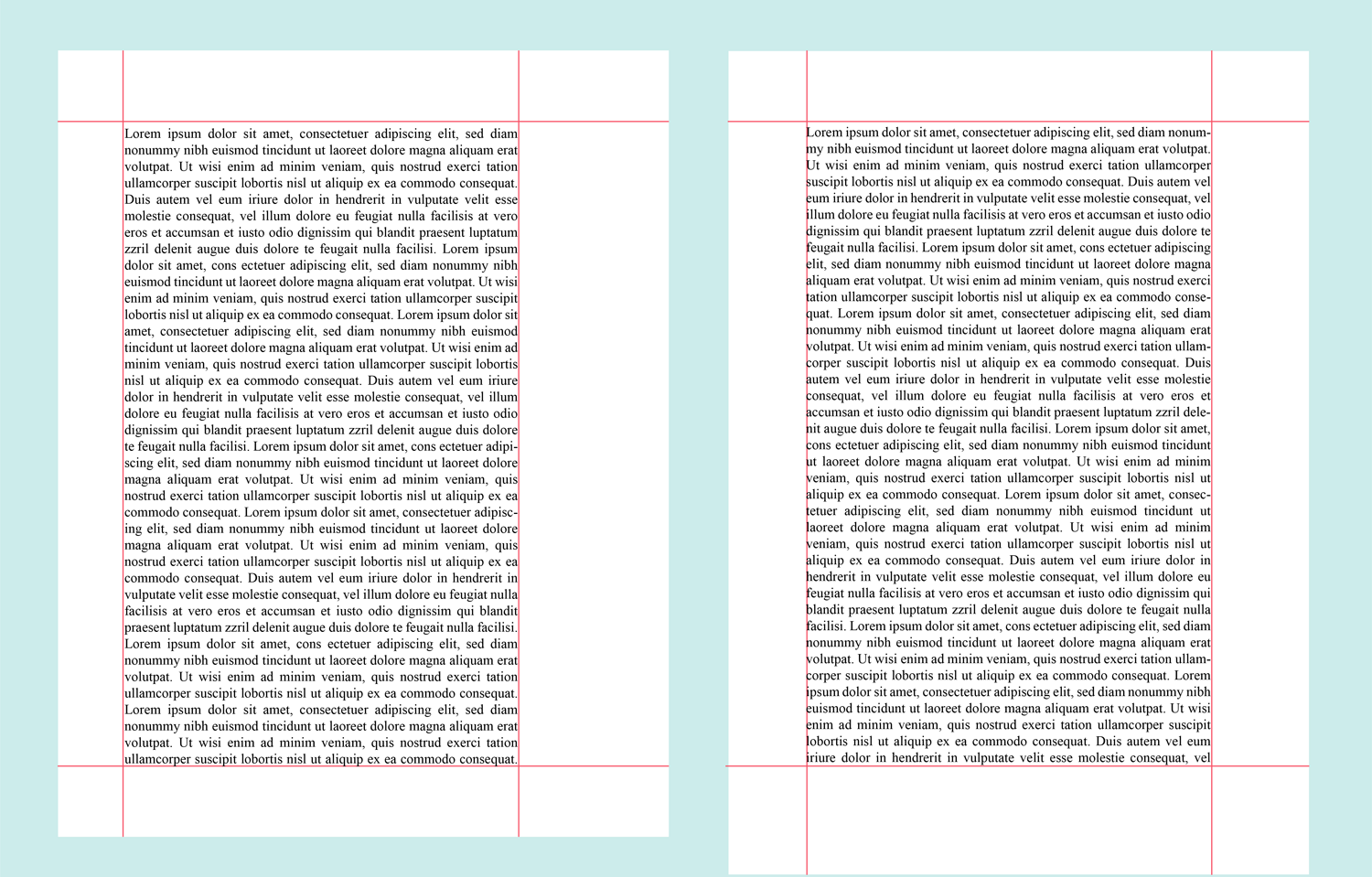
Manuscript Grid
Baseline Grid: This kind of grid is usually used for horizontal alignment.
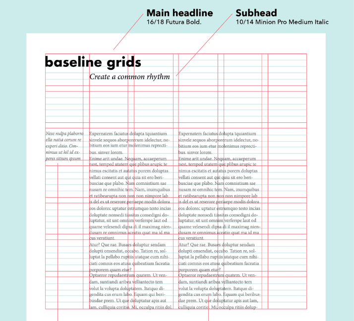
Baseline Grid
Modular Grid: Modul grid is very similar to column grid. However, it has an horizontal region marked by rows. This kind of grid is usually used in complex designs. Some popular examples of designs where modular grids can be used, include shopping carts, image galleries, etc.

Modular Grid
Choose a focal point to establish the hierarchy
Visual design is an essential tool that aids many in creating sensational works of art and relaying powerful messages to those who view the work.
The rule of thirds, which divides the space used into thirds both vertically and horizontally, helps guide artists in consciously selecting a focal point to establish a hierarchy within their design. By centering these focal points within one of the imaginary intersecting lines made by the rule of thirds, viewers’ eyes are intuitively directed toward the desired piece or section.
As demonstrated in diverse compositions like photographs, paintings, and graphic designs; when used correctly, the rule of thirds assists designers by forcing them to think critically about where they want to direct people’s attention and how to convey the mood of their artwork effectively.
Apply the Rule of Thirds to Achieve Balance
You can also use the rule of thirds to achieve balance and composition in your designs. It involves placing your focal points on any one of the four intersections to add visual interest and energy to your design. Plus, instead of having all components compete for attention, this technique helps differentiate the look by separating them in a way that when viewed further amplifies their impact on the viewer.
Final Thought
Overall, the Rule of Thirds is a great tool for creating dynamic and eye-catching designs. If you don’t know how to use the rule of thirds in design, the article above has covered all you must know to enable you to apply it effectively.
When used properly, the rule of thirds can dramatically improve the quality of your designs and make them stand out in a crowded field. Plus, it is a versatile technique that works well with many different types of graphic design, including web design.
Nevertheless, keep in mind that it’s important to use the rule of thirds in moderation. Don’t get stuck in a rut or rely too much on this rule alone when designing. Creativity and practice is the best way to find yourself becoming an expert at utilizing the Rule of Thirds effectively.