How to Create High Click-Through Rate Thumbnails That Go Viral (Part 1)

Last Updated: Nov. 11, 2024 | FEATURED IN: YouTube Tips & Tricks >
Hey, everyone! Today let’s talk about how to create extremely awesome thumbnails. A good thumbnail is like an eye-catching entry point. Only when others are tempted to click in will you get traffic. Don’t ignore it! Without further ado, let’s jump right into the tutorial. This will be divided into two installments. In this one, we’ll talk about color, visual impact, and emotions. Follow me closely and don’t fall behind!

How to Create High Click-Through Rate Thumbnails That Go Viral
I. Optimize Layout: Focus on the Main Content
1. Bold layout to attract attention
Enlarge the key points and use small elements to catch people’s eyes. For example, create a blinking little arrow that directly points to the key information to form a visual focus and achieve an instantly eye-catching effect.
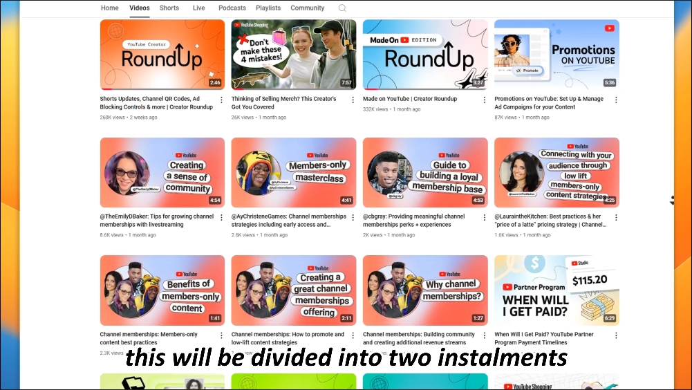
Moderate white space is essential. Don’t overcrowd the picture. Often, an asymmetric layout can better highlight visual tension. Place important elements in the corner and then use white space and guide lines to draw the audience’s line of sight over, making it appear more stylish!

moderate blank space
Set the layout according to different scenarios. If you are making tutorial videos, you can use a step-by-step layout and turn key steps into concise icons and text for display. For story videos, you can use a scene-based layout. Select a highly representative character or picture. With exaggerated expressions and vivid facial close-ups, you can quickly grab the audience’s attention.
2. New ways to avoid visual overload
Do you know? Color saturation and brightness can control people’s visual focus! Reduce the saturation of non-key elements so that they are not so glaring. Then increase the brightness of key elements to highlight distinct content!
Use blur and focus effects to blur the background or secondary elements and make the main elements clearly focused to form a layered effect.
II. Color Matching: Make Thumbnails “Pop”
1. Master color contrast:
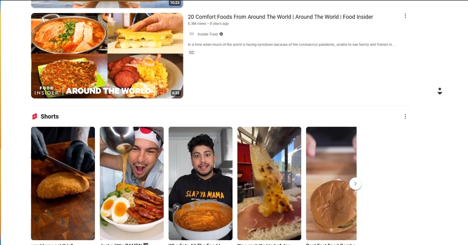
If you don’t understand color matching, don’t make it too complicated. Within three colors is best. For example, for food videos, you can use orange as the main color, yellow as a similar color, and blue as an accent color, full of vitality and warmth.

Master color contrast
The symbolic meaning and preference for colors are different in different cultures! It is recommended to analyze the cultural background of your target audience first and then choose appropriate colors. For example, in Eastern culture, red not only symbolizes urgency but also represents auspiciousness and happiness. Flexible use is excellent.
2. Colors with emotions:
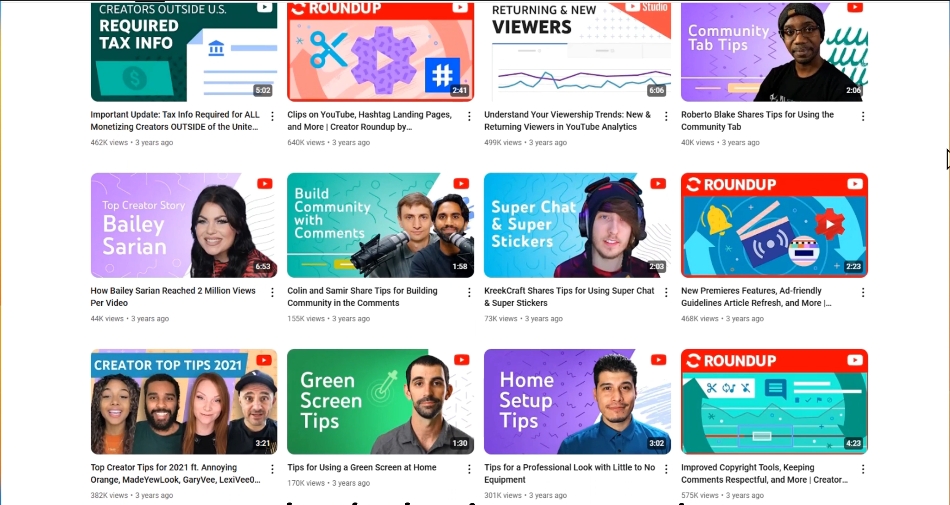
Each color has its own “emotion”. For example, blue makes people calm, while red gives a sense of urgency. Choose the right color so that the audience can feel the atmosphere of the content visually first. Purple not only represents trust but also conveys mystery and elegance, suitable for videos exploring the unknown or high-end fashion.

Colors with emotions
3. Combine with popular trends and seasonal changes:
You can choose colors by combining popular trends and seasonal changes to resonate more with the audience. In spring, use light pink and green, full of vitality. When retro style is popular, brown and gold are extremely nostalgic. Bright yellow encourages the audience to click because it represents vitality and positivity.
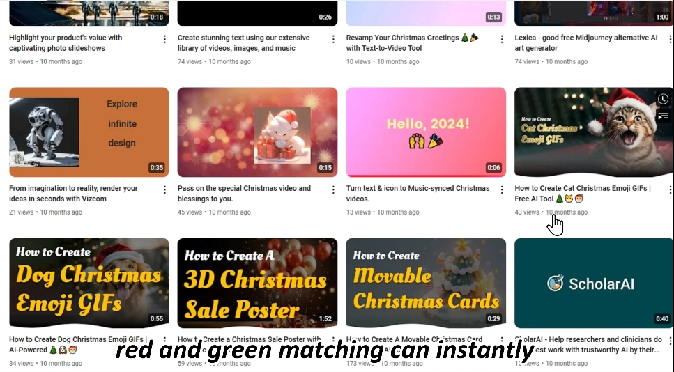
Similarly, you can add festival-specific colors. For example, during Christmas, red and green matching can instantly bring a festive atmosphere. If you still don’t know how to do it, then look at successful cases and learn how others cleverly use colors to strengthen the theme and emotions and create an emotional resonance with the audience.

add festival-specific colors
That’s all for today’s layout and color matching techniques. Do you have a better feeling for thumbnail design? However, the secrets of killer thumbnails are more than these! In the next installment, I will continue to explain advanced techniques such as expressions and concise text to take your video click-through rate to a higher level! Remember to like and subscribe. Don’t miss it. See you in the next installment!