How to Create High Click-Through Rate Thumbnails That Go Viral (Part 2)

Last Updated: Nov. 14, 2024 | FEATURED IN: YouTube Tips & Tricks >
In this episode, we will continue to dig deeper and make your thumbnails even more appealing! Today, we will cover how to skillfully use facial expressions, concise text, and the “eye movement” theory to design thumbnails, as well as some final optimization suggestions to make your thumbnails even more powerful. If you haven’t watched the previous episode, you can go and watch it first to keep up with my pace!

How to Create High Click-Through Rate Thumbnails That Go Viral
I. Using Faces + Expressions
1. Rich Facial Expressions:
Different expressions and facial angles have a great impact. Exaggerated expressions and actions, such as “surprise” or “excitement,” can quickly arouse curiosity. Remember, human faces are the most eye-catching. Different angles convey different emotional personalities. Later processing can make the face more charming. Adjust skin tone, enhance eye light, and add a slight filter effect to make the face stand out extremely in the thumbnail.
2. Strengthening the Technique of Guiding the Line of Sight:
In addition to eyes and gestures, you can also use lines, shapes, and eye guidance. Use guide lines to lead the vision from the face to the key information to highlight important elements.
Suggestion: According to the video content, choose the most suitable technique for guiding the line of sight, which should be natural and smooth without being stiff.
3. Improving High-Definition Picture Quality:
Use high-definition facial images. Clear image quality will appear more professional and eye-catching. Avoid using blurry screenshots. You can mention some common shooting techniques, such as light source selection and the degree of exaggeration of expressions.
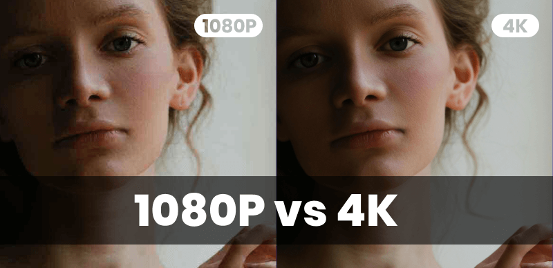
1080p vs 4K
II. Concise Text to Increase Click Desire
1. Accurately Convey Information:
There shouldn’t be too much text on the thumbnail. Through the three key points of “curiosity, clarity, and supplementation,” explain how to use short sentences to arouse the audience’s curiosity, such as “I failed” or “3 things you don’t know,” etc.
2. Contrasting Titles and Combination of Pictures and Text:
Try to create contrasts in the thumbnail and make the title and text form conflicts or suspense to stimulate the user’s curiosity.
3. Font Size and Color Selection:
Ensure that the text size is moderate, the color is prominent, and it forms a contrast with your background so that people can read the text content at a glance. If you really can’t find the right one, you can directly use font templates and color schemes.

Concise Text to Increase Click Desire
III. Using Tools: Completing Creativity
1. Make Good Use of Template Tools:
For those who are not good at design, you can use an intelligent thumbnail generator. However, try to avoid using the original version of the generator. You can modify elements such as colors, text, images, and stickers on the original template to create your personalized picture, which can also save a lot of time!
2. In-Depth Suggestions for Personalized Adjustment:
If you want to create professional thumbnails, you need to make further adjustments, such as handling color balance, shadow and highlight, filter effects, etc. In addition, adding hand-painted elements, stickers, textures, etc. will be even more unique and interesting. Pay attention to copyright issues and ensure the legality of elements.
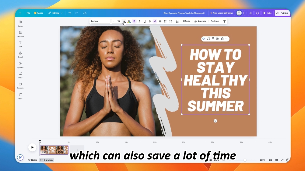
Personalized Adjustment
IV. Leverage the “Eye Movement” Theory: Enhance Visual Appeal
1. Natural Path of Sight:
In the “Z” shape and “F” shape, most people will browse thumbnails from left to right and from top to bottom. This can help you arrange important information more scientifically. For example, for plot videos, set suspense elements at the beginning to guide the audience to browse the thumbnail.
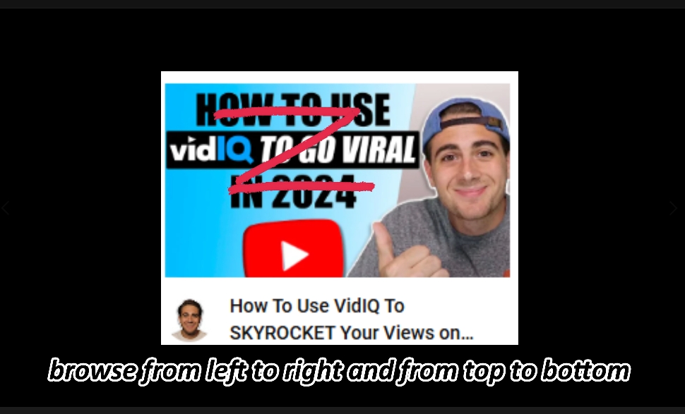
Natural Path of Sight
2. Guiding the Audience’s Line of Sight:
You can also use means such as gradient colors and focused lighting effects to lead the audience’s line of sight to a specific area, such as guiding to the theme or key elements of the video.
V. Track Click-Through Rate: Establish Improvement Feedback
1. Establish a Comprehensive Click-Through Rate Evaluation System:
This is not just about letting you look at the click-through rate of a single video, but about establishing a comprehensive evaluation system. Use the indicators of YouTube Studio to evaluate the video effect.
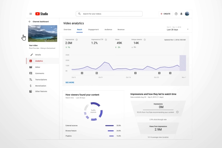
Establish Improvement Feedback
2. Gradually Optimize Thumbnails:
It is recommended to analyze viewing data and continuously adjust the thumbnail style according to the performance after each optimization until you find the design style that is most suitable for your channel.
Well, that’s all for today. If you find it useful, go and try it quickly! Create your killer thumbnail. If you also have thumbnail tips, welcome to share them in the comment area so that we can communicate and grow together! See you next time!