With over 130 million users and counting, OnlyFans has quickly become one of the hottest social media platforms for creators to monetize their content. But like any social platform, standing out from the crowd is essential to gain followers and drive subscriptions. This is where your OnlyFans banner comes in. Your banner acts as your page’s cover photo, first impression, and branding. The correct Onlyfans banner size can differ between fading into the background or popping on fans’ feeds.

OnlyFans Banner Size & Dimensions
So, whether you’re new to OnlyFans or looking to refresh your page, let’s dig into this article. Here, I’ll discuss ideal banner sizes, design tips, and tricks to create the perfect banner to promote your brand and boost your OnlyFans success. Let’s get into it.
Table of Contents: hide
Why Are OnlyFans Banners Important for Your Channel?
OnlyFans Banners Specifications
Text and graphics on OnlyFans banners
How often should you change your Onlyfans Banner?
Why Are OnlyFans Banners Important for Your Channel?
Your OnlyFans banner is one of the most essential elements for standing out and driving subscriptions to your channel. Here’s why your banner deserves special attention:
- Makes a Strong First Impression: The banner is the first thing potential fans see when visiting your page. A clean, engaging banner makes a great first impression and invites fans to learn more about you.
- Brands Your Channel: An on-brand, consistent banner reinforces your channel’s image and helps you stand out. It’s your logo, vibe, and identity all in one image.
- Allows Customization: Banners will enable you to showcase your style and aesthetics. Customize your banner with your brand colors, personality, and ideal image to attract your perfect fans.
- Can Increase Clicks: Banners with clear profile photos, exciting graphics, and strong branding see up to 65% higher click rates.
- Sets the Tone: Your banner image informs fans what content to expect on your channel before subscribing.

Onlyfans Banner Size
OnlyFans Banners Specifications
Now that you know why your OnlyFans banner is so important, let’s dive into the key specs and dimensions you need to design a top-performing banner:
Dimensions for OnlyFans Banners
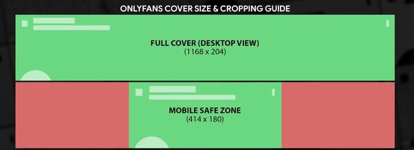
OnlyFans banners come in different sizes depending on what device viewers are using. The desktop banner size is 1168 x 204 pixels. This horizontal rectangular banner appears on a computer screen at the top of your OnlyFans channel.
For mobile users, this size can’t fit as the banner will be cropped on both measures. Therefore, you have to adjust the size as per your preference. It is suggested that you use a 414 x 180 pixels size for mobile users to fit the vertical screen. However, you can choose this size per your preference – while focusing your brand’s image in the center. Use these exact wide desktop and square mobile dimensions to create a crisp, professional banner adapted for all screens.
Format for OnlyFans Banners
Along with the right sizing, the format and file type of your OnlyFans banner also matter.
For the banner image itself, JPG or PNG formats are recommended. JPG works well for banners with photo backgrounds. PNG is best for graphics with flat colors or transparency. Either will allow your banner to load quickly and display high quality on OnlyFans.
Avoid unfamiliar formats like TIFF or exotic extensions. Stick to universally recognized JPG or PNG for maximum compatibility. Also, keep your file under 2-3 MB – this prevents large files that are slow to load.
In addition, remember your OnlyFans banner displays on a webpage. So, your image will be layered on top of the site’s template. If you design the banner on a blank canvas, it may look awkward or disjointed when uploaded. A mockup template close to the OnlyFans layout ensures your banner integrates smoothly.
The Aspect Ratio for OnlyFans Banners
The aspect ratio, or width-to-height ratio, is another key consideration for OnlyFans banners.
The aspect ratio varies since OnlyFans banners come in horizontal rectangular desktop and square mobile sizes. Aim for a wide landscape orientation around 3.6:1 for the desktop to match the 5.73 aspect ratio. This gives ample width to showcase graphics, photos, text, and other elements.
For mobile, switch to a 1:1 square aspect ratio or try any custom ratio that best displays your image.
Using inconsistent aspect ratios will lead to distortion, cropping issues, and a disjointed look. For example, a tall vertical banner will get awkwardly squished on the desktop. Moreover, avoid spillover or empty areas by keeping the banner perfectly square.
*OnlyFans banner specifications for mobile are not mentioned by the official site. Experts recommend the above specs to avoid the issue of cropping.

Onlyfans Sizing
Text and graphics on OnlyFans banners
When designing the graphics and text for your OnlyFans banner, a few best practices will optimize your banner:
- Profile Photo: Include a clear photo of yourself so fans can easily recognize you. Place it prominently near the center.
- Branding and Usernames: Add your channel name, username, or branding graphics. This helps reinforce recognition.
- Offer or Value Proposition: Consider including a special offer, discount, or value proposition like “50% off for the first month!”
- Keep It in The Center: The banner gets cropped from the center for mobile users. Therefore, try placing the logo or brand name horizontally in the center.
- Clean, Simple Text: Avoid cluttered or messy text. Use a clear, readable font and adequate white space.
- Complimentary Graphics: Add infographics, illustrations, or other graphics that support your brand visually.
- High-Quality Images: Any photos or graphics should be crisp and high-resolution for a polished look.
- Consistent Branding: Keep colors, fonts, and overall style on-brand for you.
- Clear Call-To-Action: Add CTA such as “Join Now,” “Subscribe Here,” etc, to prompt visitors to follow/subscribe.
How often should you change your Onlyfans Banner?
Determining how often to refresh your OnlyFans banner is an essential part of your branding that can help keep your page looking fresh. Approach banner updates with strategy instead of changing sporadically. Here are some tips on ideal banner update frequency:
1. Match Banner to Content Changes
As your OnlyFans content focus evolves significantly, like entering a new niche or offering new services, update your banner to match. This visual change lets regular fans know to expect new things from your page.
2. Coordinate with Major Marketing Campaigns and Launches
When running major promotional campaigns for OnlyFans, launching a new service, or having contests or giveaways, swap your banner temporarily to tie in. Special event branding reinforces initiatives and gets more eyes on your marketing.
3. Alter Banners for Major Holidays
Consider using seasonal or holiday-themed banners to mark occasions like Valentine’s Day, Halloween, Christmas, etc. Festive limited-time banners allow you to join in the fun while showing personality.
4. Rotate Banners Monthly or Quarterly
Regularly rotating your OnlyFans banner monthly or quarterly ensures your page looks fresh and dynamic to frequent returning visitors. Make banner updates part of your regular content calendar.
5. Evolve Banner When Rebranding
Upgrade your banner to match if you’re rebranding your OnlyFans channel with a new look and feel. Showcase the new brand image, personality, messaging, colors, and offerings consistently.
5. Capitalize on Trends with Timely Banners
Stay on top of hot trends, current events, or timely happenings your audience cares about. Limited banners tied to trends can increase clicks and subscriptions if executed while staying on-brand.
6. Milestone Moment Banner Updates
Mark major follower milestones by swapping your banner to celebrate growth and keep long-term fans rewarded and engaged. Milestone calls are great update timing.
7. Avoid Changing Banners Too Frequently
While freshness is good, updating too erratically or frequently can seem off-putting and diminish brand consistency. You should change a banner every 2-3 months. However, if there is any campaign or new offer, as mentioned above, you can change it every week to align with your content schedule.
8. Test and Optimize Update Frequency
Try different banner variations and update frequencies to nail down the optimal approach for your brand. Analyze performance to dial in ideal change.
Frequently Asked Questions About Onlyfans Banner
1. How do I make my OnlyFans banner fit?
To ensure your OnlyFans banner fits properly, create it in the exact dimensions of 1168 x 204 pixels for desktop and 414 x 180 pixels square for mobile. This avoids distortion or cropping issues. Also, use the ideal 3.6:1 landscape and 1:1 square aspect ratio for desktop and mobile banners, respectively.
2. What key elements should you include in your OnlyFans banner?
Key elements to include in your OnlyFans banner are a clear profile photo of yourself, your username/branding, an engaging headline or value proposition, high-quality graphics related to your niche, minimal clean text, and a strong call to action for visitors to subscribe.
3. What is a good OnlyFans profile pic?
A good OnlyFans profile picture is a clear, high-quality headshot of your face that fans can easily recognize you with. Smiling directly at the camera, dressed attractively yet appropriately, helps connect with subscribers.
Final Thought
An optimized OnlyFans banner is crucial for making a great first impression, establishing your brand, and driving subscriptions. Following the OnlyFans banner size specifications, including proper dimensions and aspect ratios for desktop and mobile, using engaging graphics and text, and updating it strategically can help your OnlyFans page stand out and succeed. Take the time to create a banner aligned with your brand and content to maximize your OnlyFans presence.
